Experience Builder section consists of 12% of total score in the Salesforce Community Cloud Consultant certification exam, covering topics such as customizing a Community using Experience Builder, configuring Lightning pages and components, and etc. Without further ado, lets get started!
NOTE: This post is written in June 2020 and content might be changed/updated overtime. The content is inspired by focusonforce.com.
Guideline for Experience Builder
- Determine how to customize a Community to match a company’s branding using Experience Builder.
- Determine how to customize navigation for given requirements in a template-based Community.
- Determine the steps to create and configure Lightning pages.
- Explain how to configure template components for given requirements.
- Determine the steps to install and set up Lightning components.
- Determine how to optimize Community performance.
Components
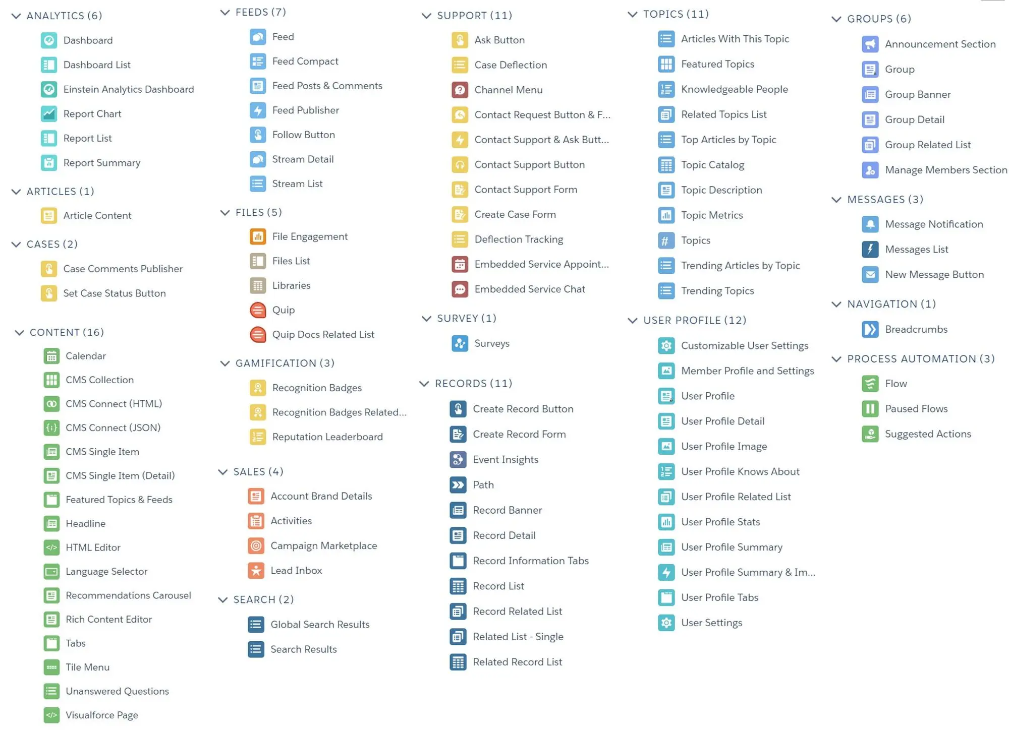
- Template Component Types:
- Compact Header
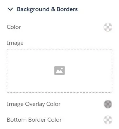
- Background & Borders
- Background Color
- Background Image
- Image Overlay Color
- Bottom Border Color
- Links
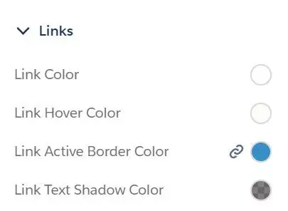
- Link Color
- Link Hover Color
- Link Active Border Color
- Link Text Shadow Color
- Dropdown Menus
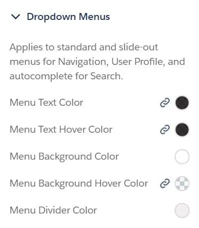
- Menu Text Color
- Menu Text Hover Color
- Menu Background Color
- Menu Background Hover Color
- Menu Divider Color
- Layout
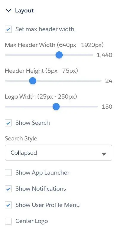
- Set max header width (640px - 1920px)
- Header Height (5px - 75px)
- Logo Width (25px - 250px)
- Show Search
- Search Style
- Collapse (click icon to show search bar)
- Expanded
- Show App Launcher
- Show Notifications
- Show User Profile Menu
- Center Logo
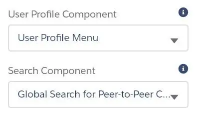
- User Profile Component (replace layout’s default User Profile component with custom component, if any)
- User Profile Menu
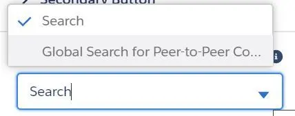
- Search Component (replace layout’s default search component with a custom component, if any)
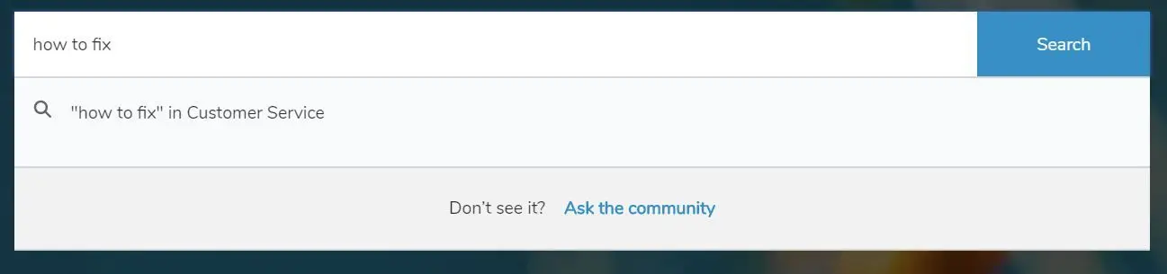
- Search
- Global Search for Peer-to-Peer Community
- Hero
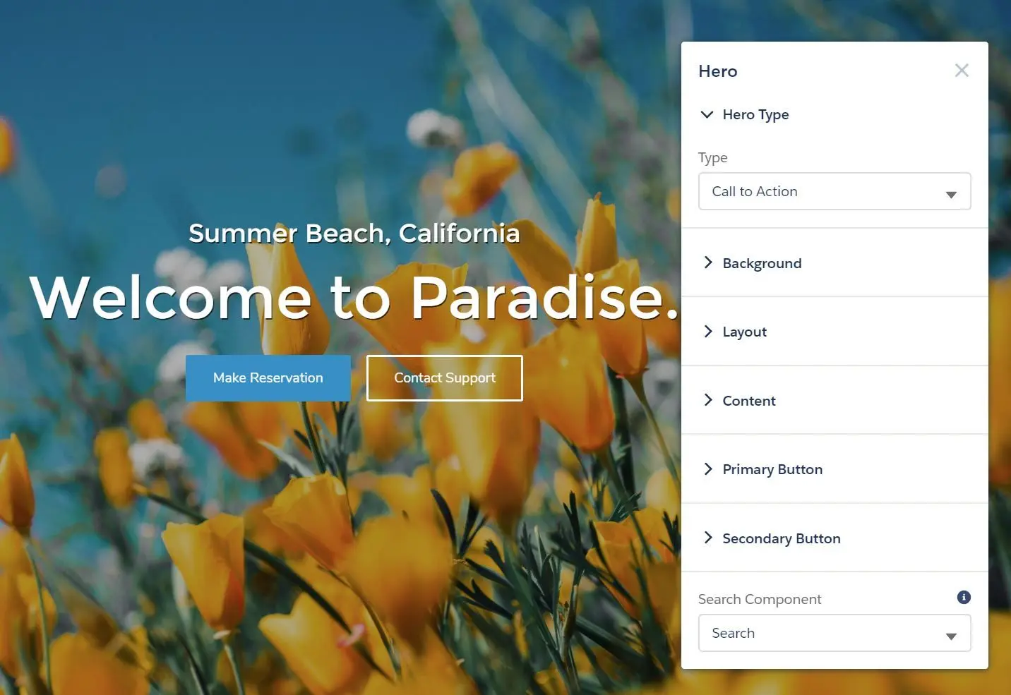
- Hero Type
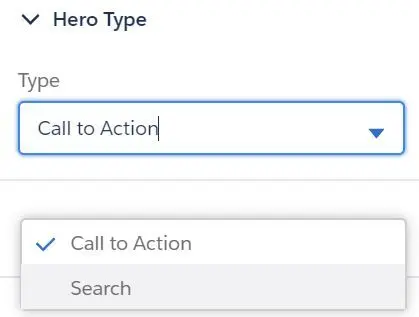
- Type:
- Call to Action (Primary and Secondary Button)
- Primary Button
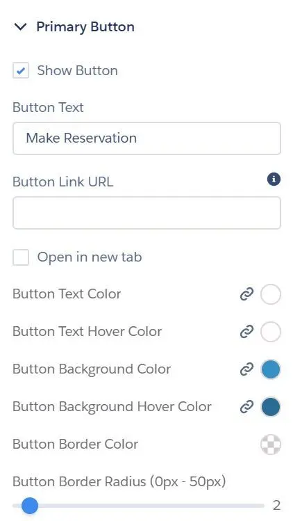
- Show Button
- Button Text
- Button Link URL
- Open in new tab
- Button Text Color
- Button Text Hover Color
- Button Background Color
- Button Background hover Color
- Button Border Color
- Button Border Radius (0px - 50px)
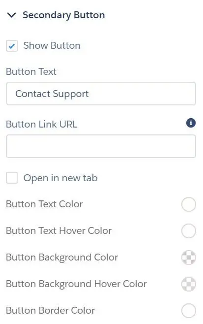
- Secondary Button
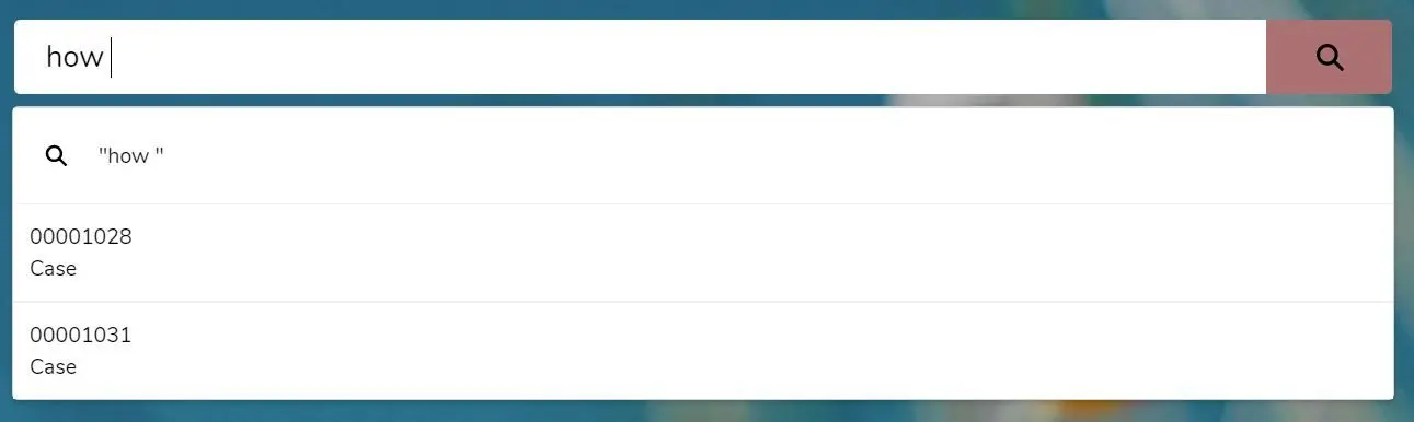
- Search
- Search
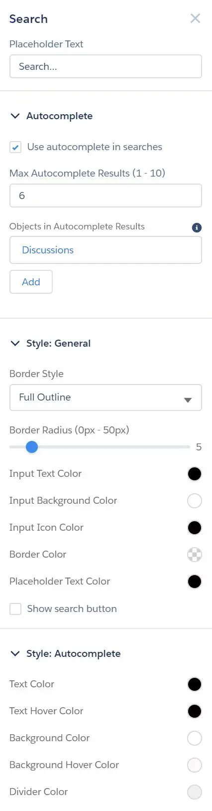
- Placeholder Text
- Autocomplete
- Use autocomplete in searches
- Max Autocomplete Results (1 - 10)
- Objects in Autocomplete Results (add multiple objects)
- Style: General
- Border Style (Full Outline, Bottom Border)
- Input Text Color
- Input Background Color
- Input Icon Color
- Border Color
- Placeholder Text Color
- Show search button
- Button Background Color
- Button Background Hover Color
- Style: Autocomplete
- Text Color
- Text Hover Color
- Background Color
- Background Hover Color
- Divider Color
- Search
- Global Search for Peer-to-Peer Communities
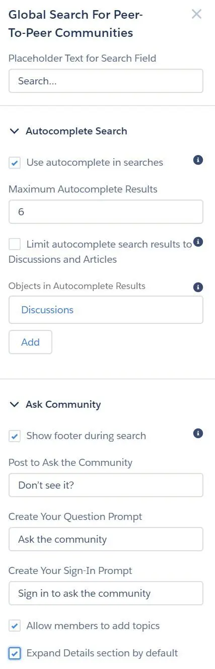
- Placeholder Text for Search Field
- Autocomplete Search
- Use autocomplete in searches
- Maximum Autocomplete Results
- Limit autocomplete search results to Discussion and Articles
- Objects in Autocomplete Results (add multiple objects)
- Ask Community
- Show footer during search
- Post to Ask the Community
- Create Your Question Prompt
- Create Your Sign-In Prompt
- Allow members to add topics
- Expand Details section by default
- Primary Button
- Call to Action (Primary and Secondary Button)
- Type:
- Background
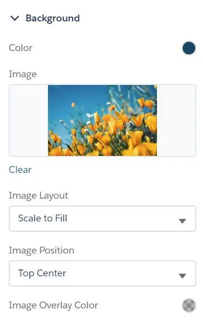
- Color
- Image
- Image Layout (Scale to Fill, Fit, Tile, Tile Horizontally, Tile Vertically)
- Image Position ((Top/Bottom) Center, (Top/Bottom) Left, (Top/Bottom) Right)
- Image Overlay Color
- Layout
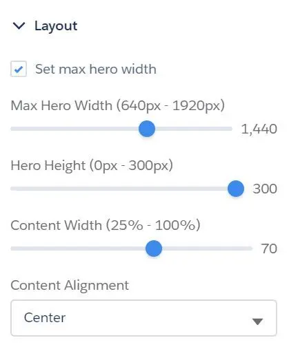
- Set max hero width (640px - 1920px)
- Hero Height (0px - 300px)
- Content Width (25% - 100%)
- Content Alignment (Center, Left, Right)
- Content
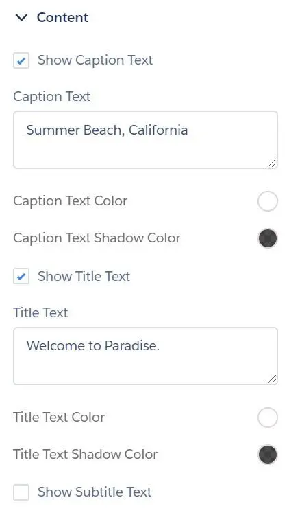
- Show Caption Text (text above title)
- Caption Text
- Caption Text Color
- Caption Text Shadow Color
- Show Title Text (primary text)
- Title Text Color
- Title Text Shadow Color
- Show Subtitle Text (secondary text below title)
- Subtitle Text Color
- Subtitle Text Shadow Color
- Search Component (Search or Global Search for Peer-to-Peer Community)
- Compact Header
- Analytics
- Dashboard
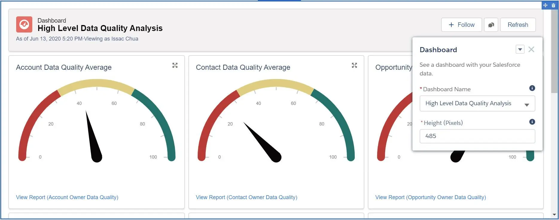
- Dashboard Name
- Height (in pixels)
- Einstein Analytics Dashboard
- Dashboard
- Height (in pixels)
- Filter
- Show Sharing Icon
- Show Title
- Show Header
- Open Links in New Windows
- Hide on Error
- Report Chart
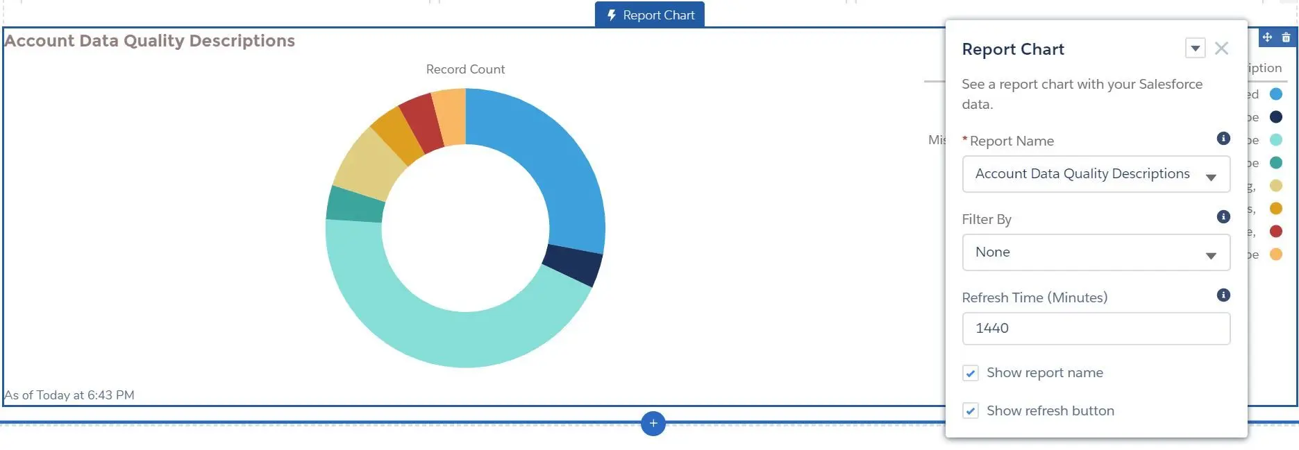
- Report Name
- Filter By (None or Id)
- Refresh Time (Minutes)
- Show report name
- Show refresh button
- Dashboard
- Content
- Calendar
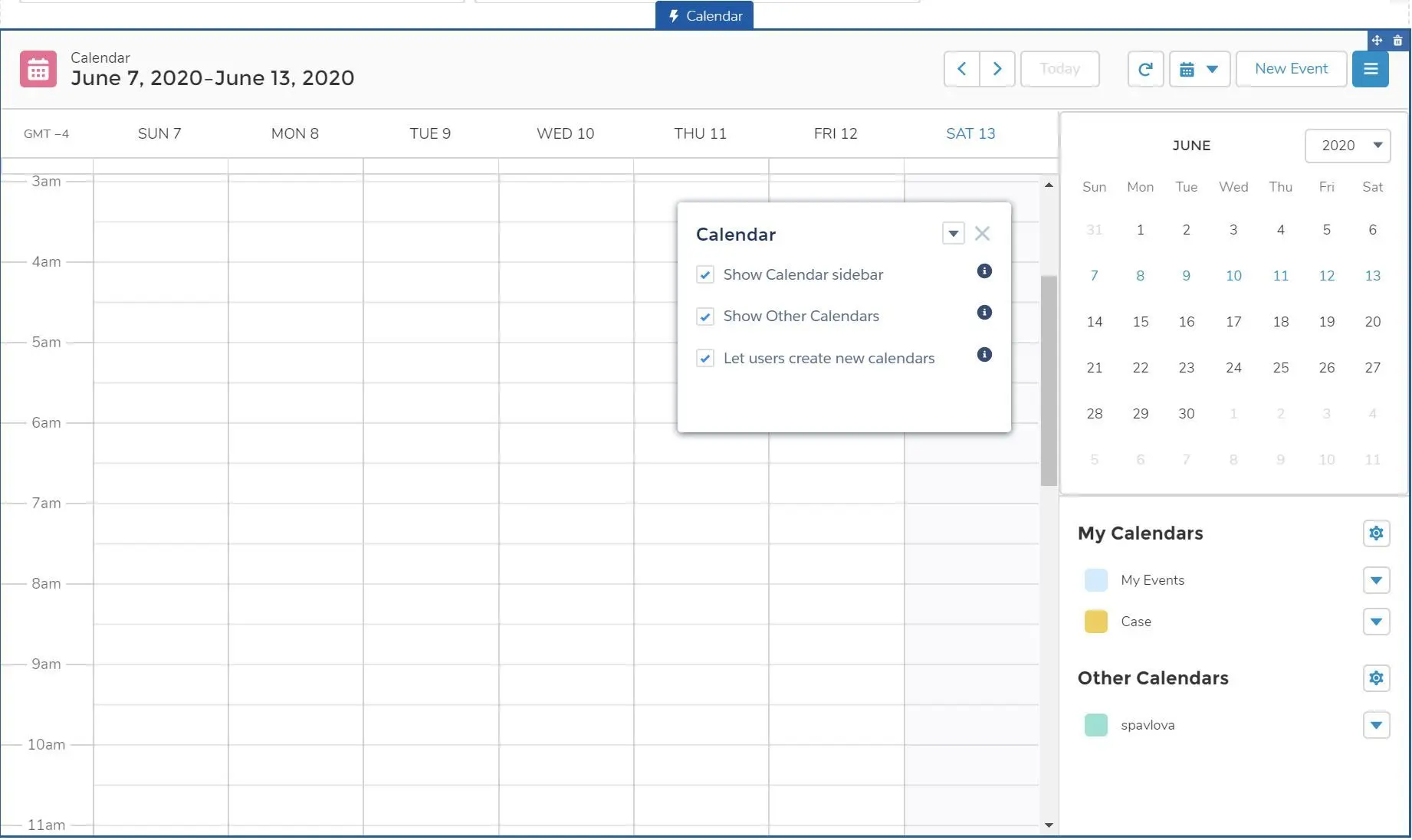
- Show Calendar sidebar
- Show Other Calendars
- Let users create new calendars
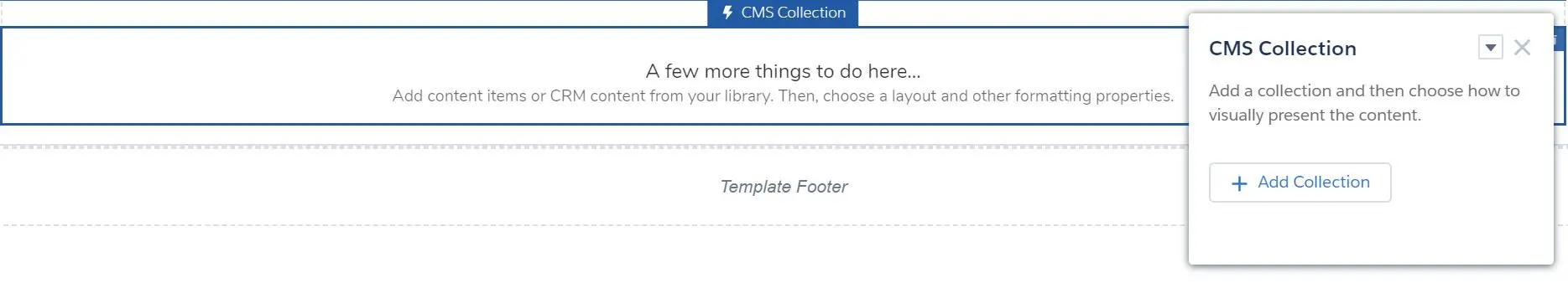
- CMS Collection
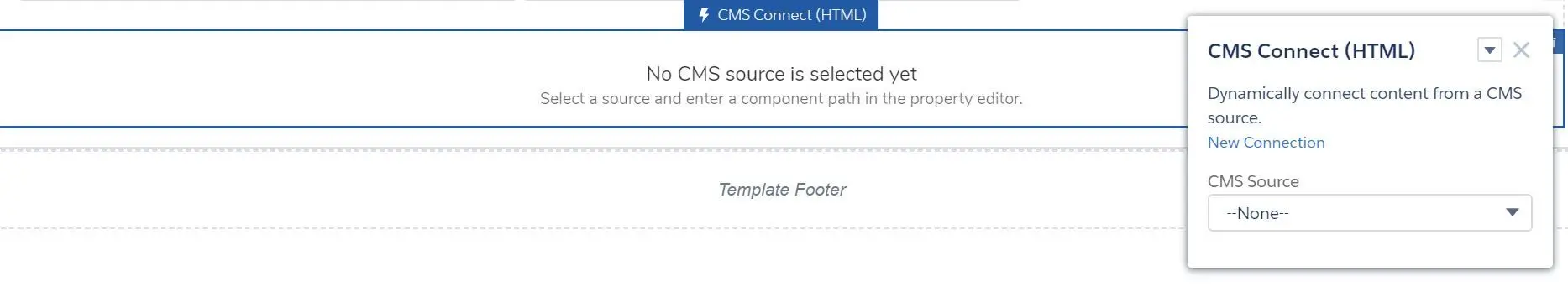
- CMS Connect (HTML)
- CMS Connect (JSON)
- CMS Single Item
- Featured Topics & Feeds
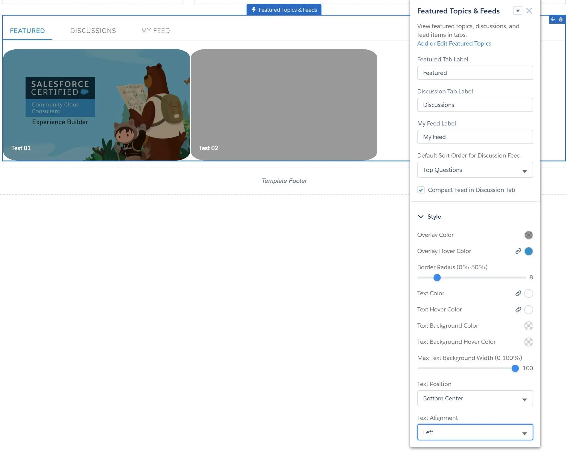
- Add or Edit Featured Topics
- Featured Tab Label
- Discussion Tab Label
- My Feed Label
- Default Sort Order for Discussion Feed
- Top Questions
- Latest Posts
- Most Recent Activity
- Compact Feed in Discussion Tab
- Style
- Overlay and Text Colors
- Border Radius (0% - 50%)
- Max Text Background Width (0% - 100%)
- Text Position ((Top/Bottom)Left, (Top/Bottom)Center, (Top/Bottom)Right)
- Text Alignment (Left, Center, Right)
- Headline
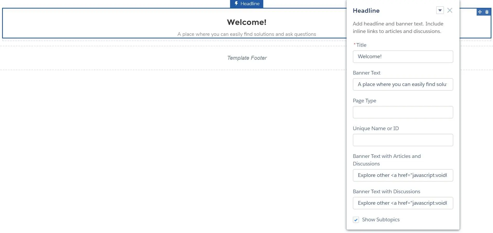
- Title
- Banner Text
- Page Type (article, topic, discussion)
- Unique Name or ID (ID from the URL of the question or article)
- Banner Text with Articles and Discussions
- Banner Text with Discussions
- Show Subtopics
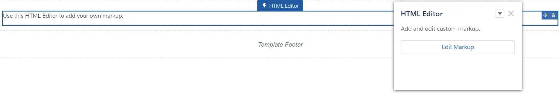
- HTML Editor
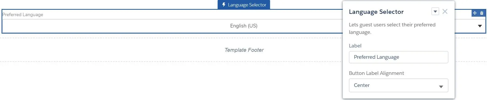
- Language Selector
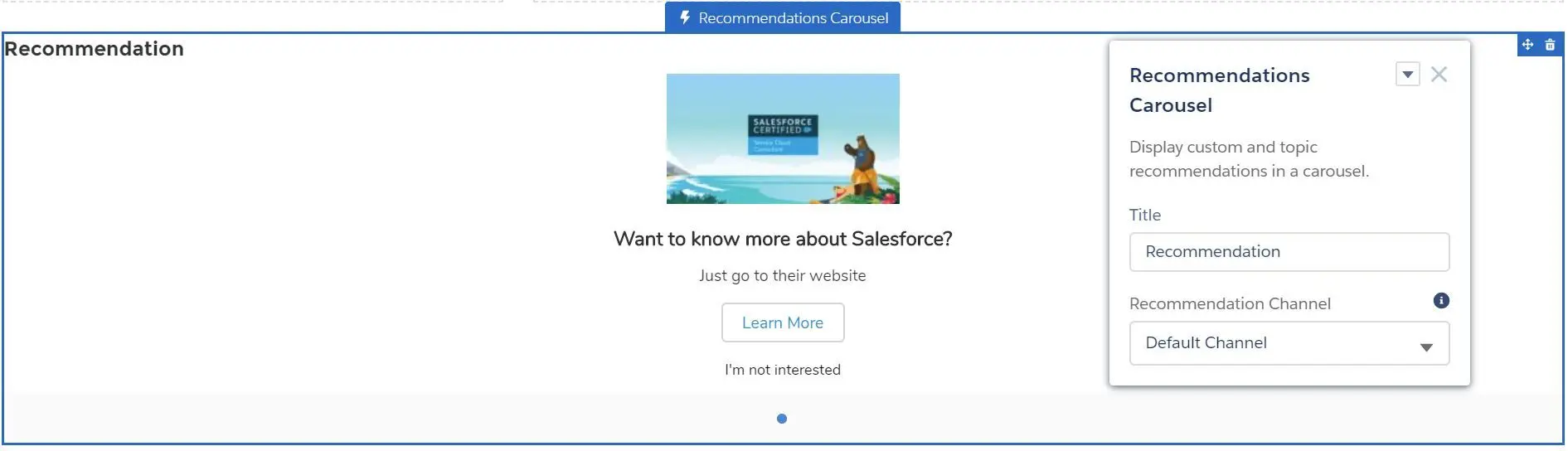
- Recommendations Carousel
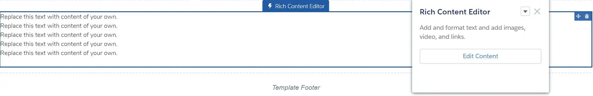
- Rich Content Editor
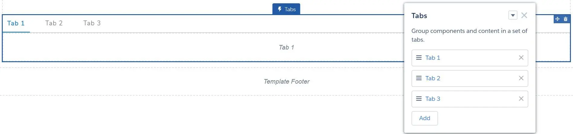
- Tabs
- Tile Menu
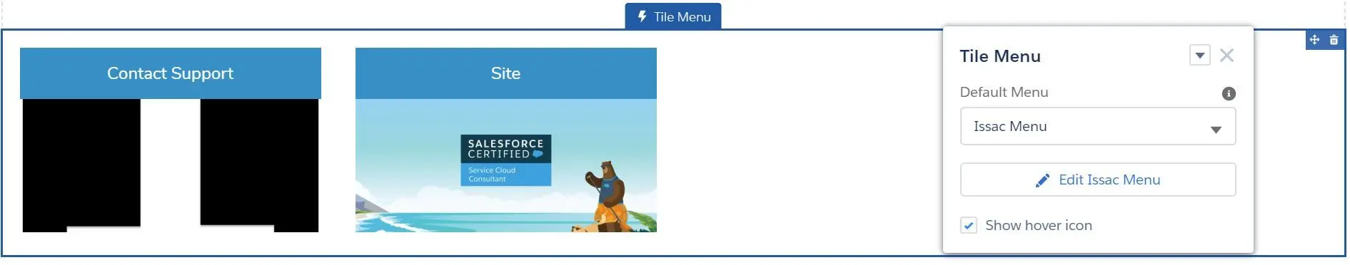
- Default Menu
- Show hover icon
- NOTE: Navigational Topic and Menu Label are not supported.
- Unanswered Questions
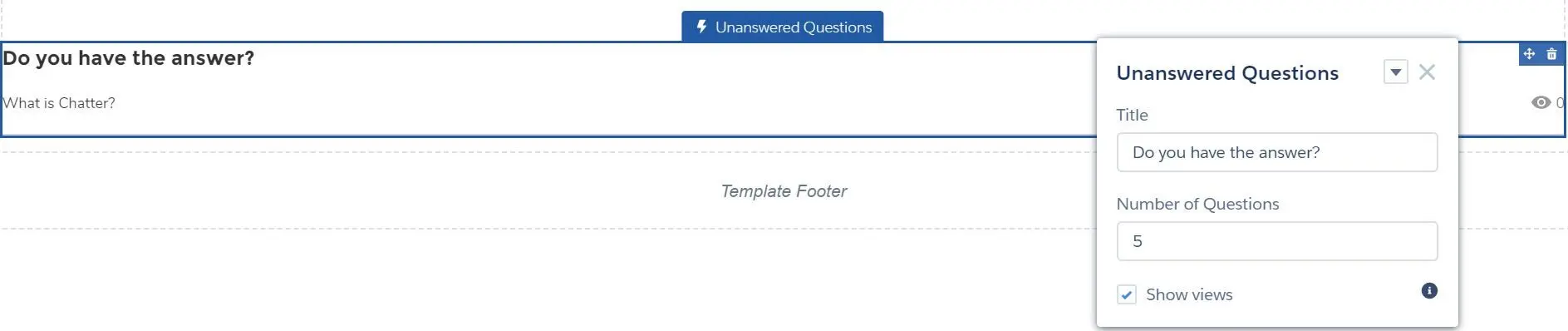
- Title
- Number of Questions
- Show views
- Visualforce Page
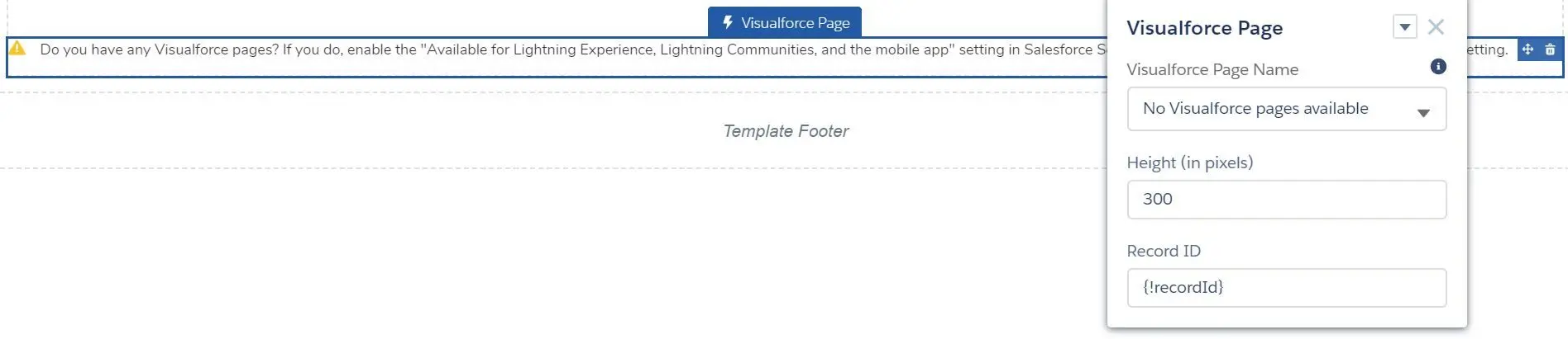
- Visualforce Page Name
- Height (in pixels)
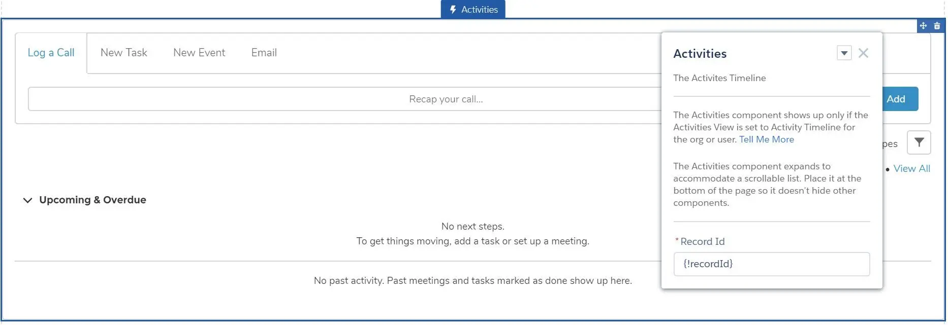
- Record ID
- Calendar
- Feeds
- Feed
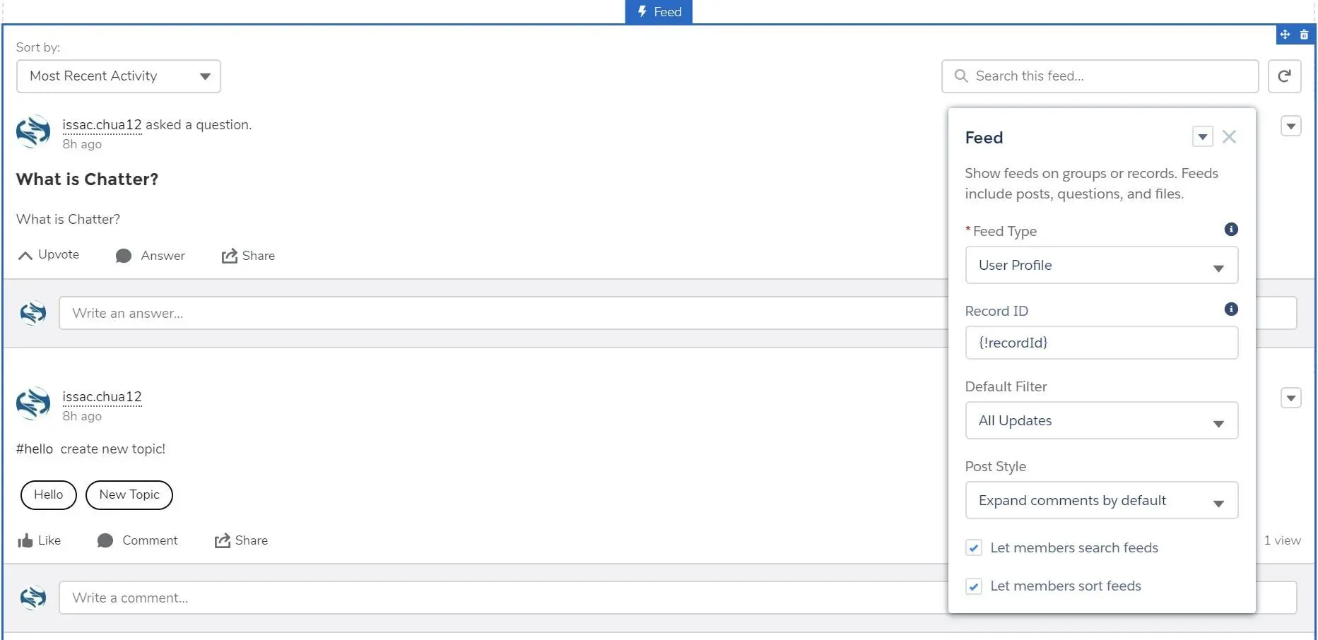
- Feed Type
- Community Discussion
- Group or Record
- My Feed
- Topic
- User Profile
- Bookmark
- Record ID (required for Group or Record, Topic)
- Default Filter (All Updates, All Questions, Unanswered Questions, Questions with No Best Answer, Questions with Best Answer)
- Default Sort Order (Top Posts, Latest Posts, Most Recent Activity)
- Post Style (Expand comments by default, Collapse comments by default)
- Let members search feeds
- Let members sort feeds
- Feed Type
- Feed Compact
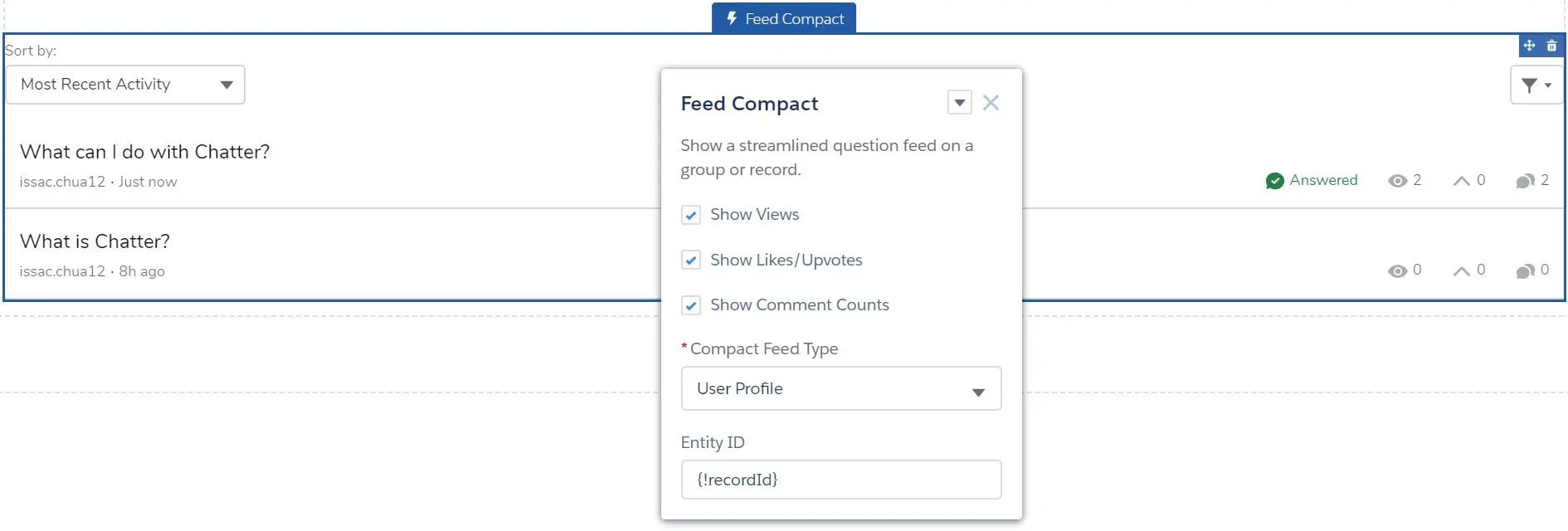
- Show Views
- Show Likes/Upvotes
- Show Comment Counts
- Compact Feed Type
- User Profile
- Community Discussion
- Group or Record
- My Feed
- Topic
- Bookmarks
- Entity ID
- Feed Publisher
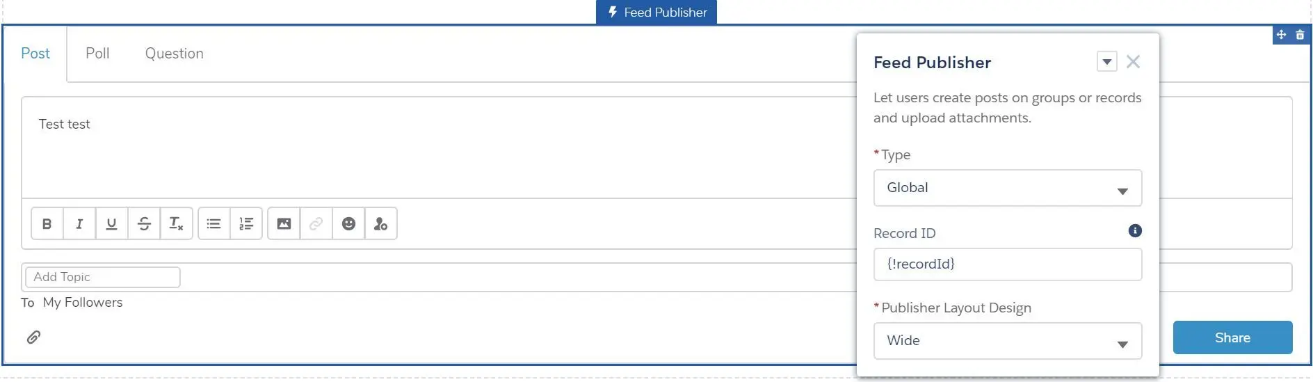
- Type (Global, Record)
- Record ID (for Record)
- Publisher Layout Design (Wide, Narrow)
- Feed
- Files
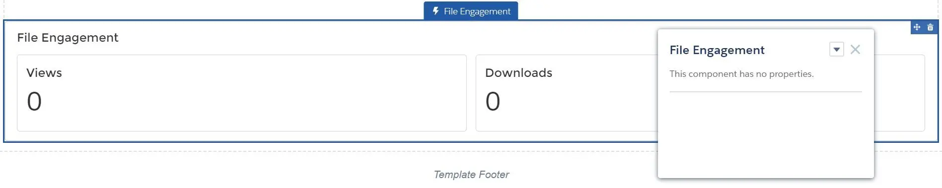
- File Engagement
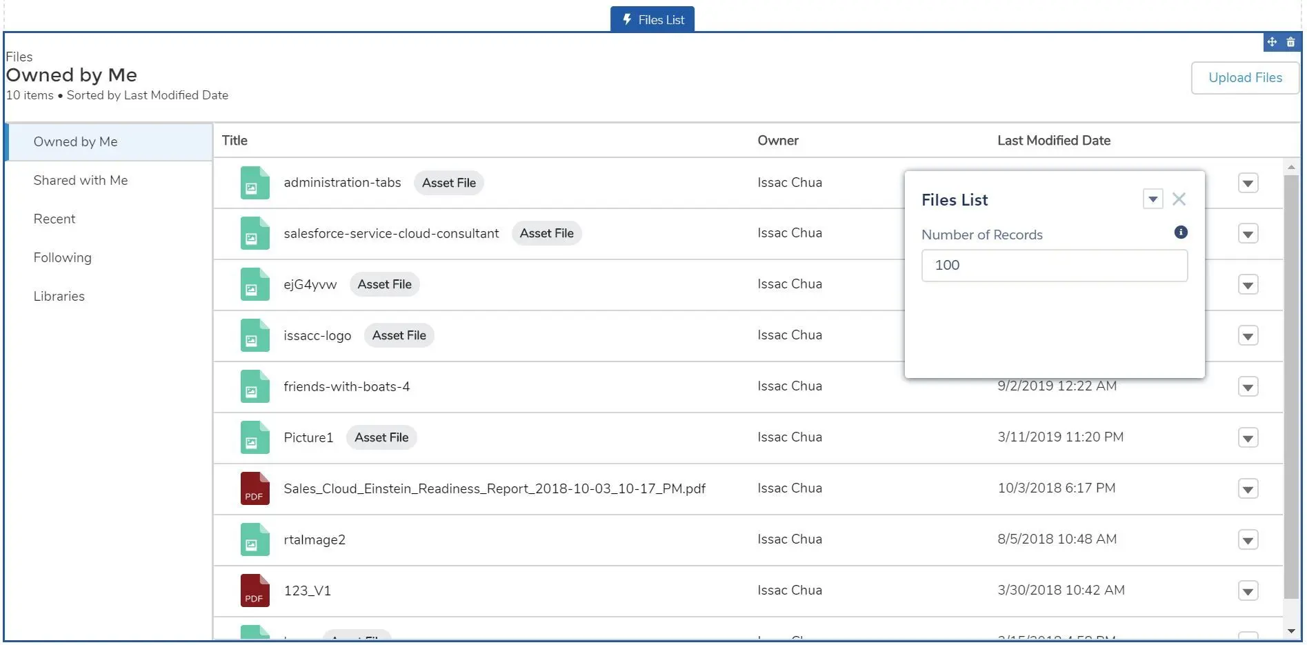
- Files List
- Libraries
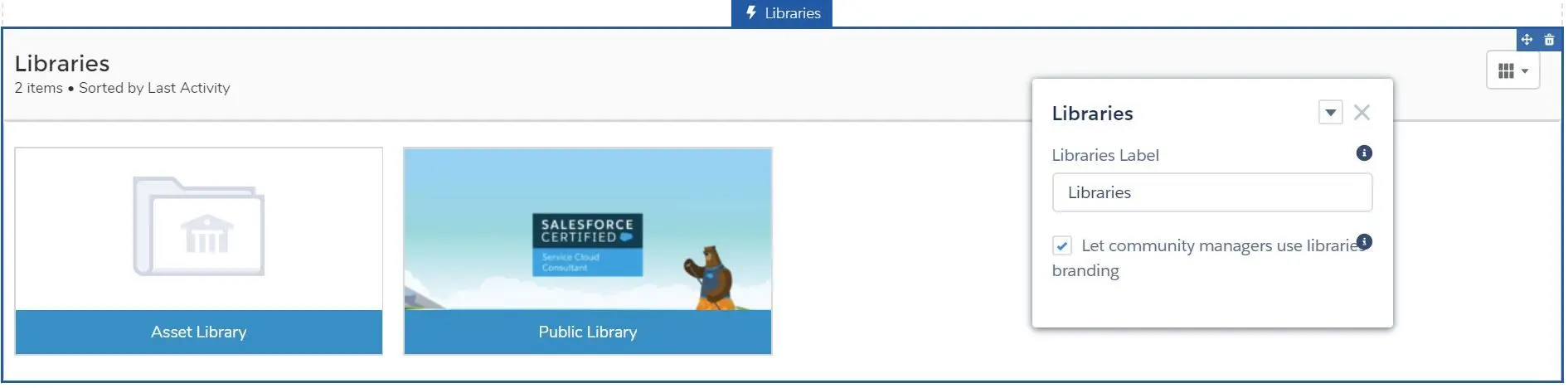
- Libraries Label
- Let community managers use libraries branding (community manager can use custom library assets image on the tile component)
- Display as Table or Tile
- Quip Docs Related List
- File Engagement
- Gamification
- Recognition Badges
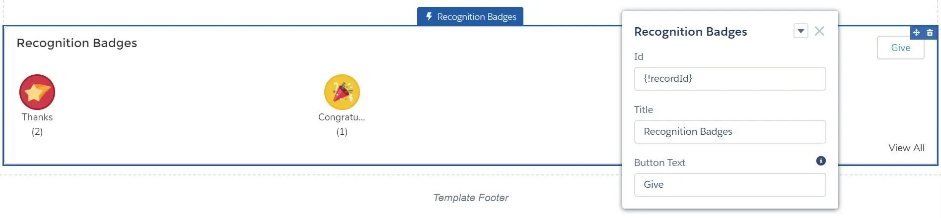
- Id
- Title
- Button Text
- Reputation Leaderboard
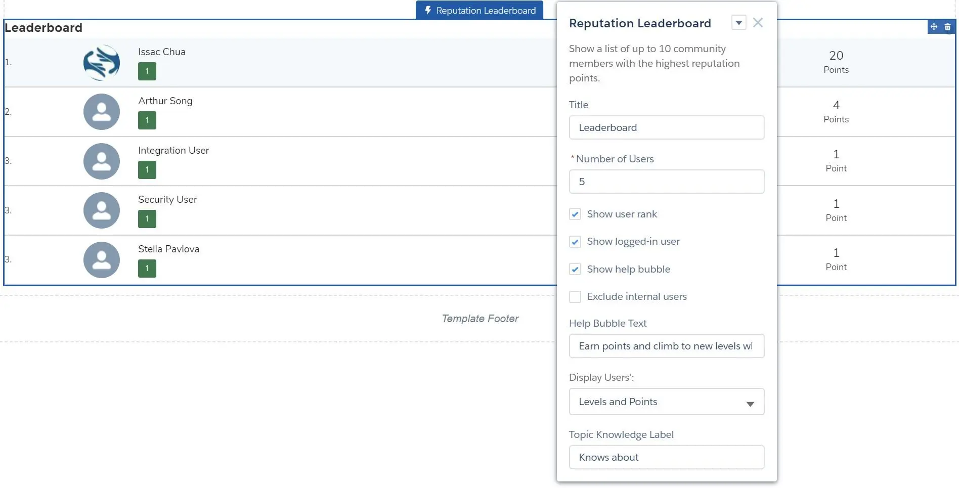
- Title
- Number of Users
- Show user rank
- Show logged-in user
- Show help bubble
- Exclude internal users
- Help Bubble Text
- Display Users’:
- Levels and Points
- Topic Knowledge and Points
- Topic Knowledge and Last Active
- Topic Knowledge Label
- Recognition Badges
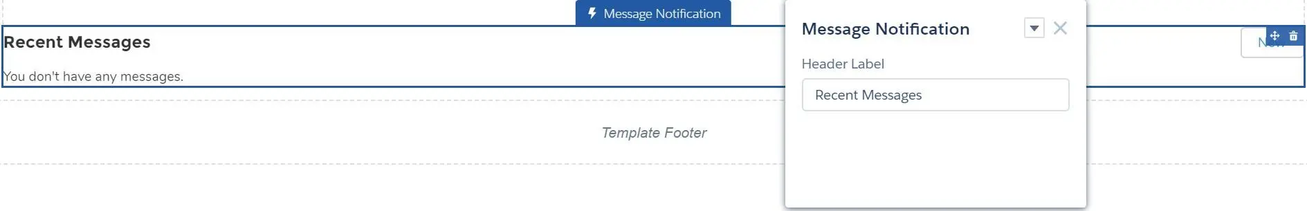
- Messages
- Message Notification
- New Message Button
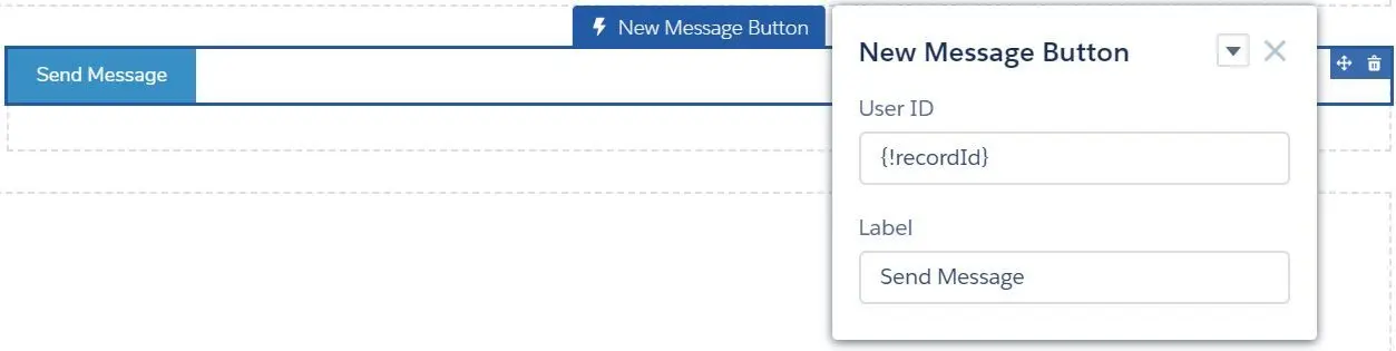
- User ID
- Label
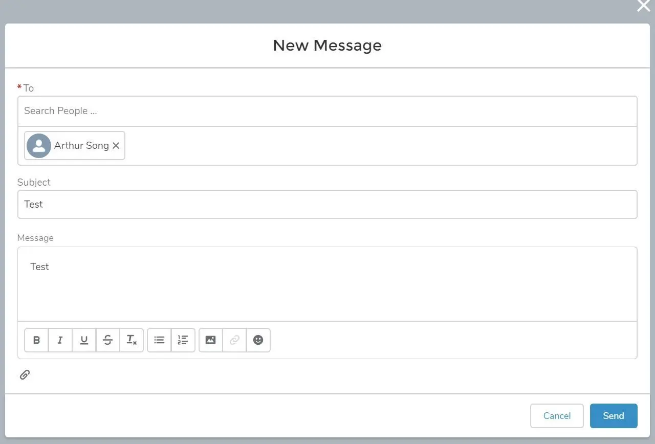
- Send new message:
- Message Notification
- Process Automation
- Flow
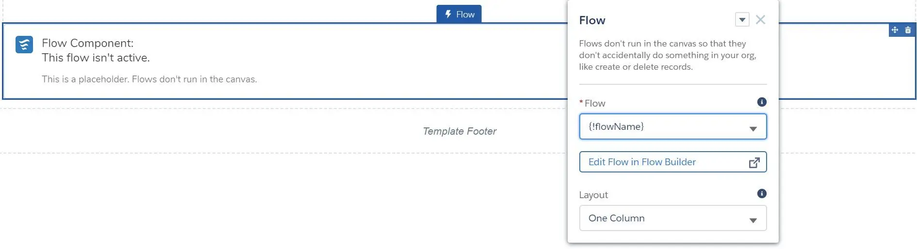
- Flow (select flow or use
{!flowName}) - Edit Flow in Flow Builder (popup page)
- Layout (One Column, Two Column)
- Flow (select flow or use
- Paused Flows
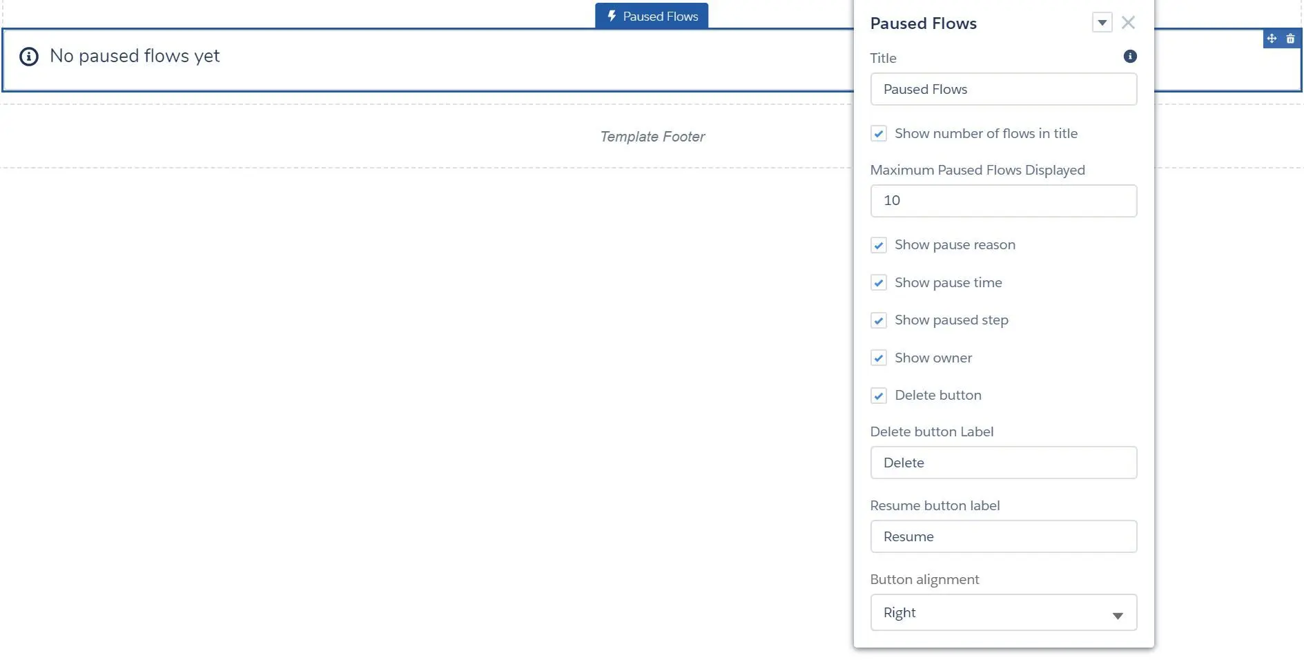
- Title
- Show number of flows in title
- Maximum Paused Flows Displayed
- Show pause reason
- Show pause time
- Show pause step
- Show owner
- Delete button
- Delete button Label
- Resume button Label
- Button alignment (Left, Right, Center)
- Suggested Actions
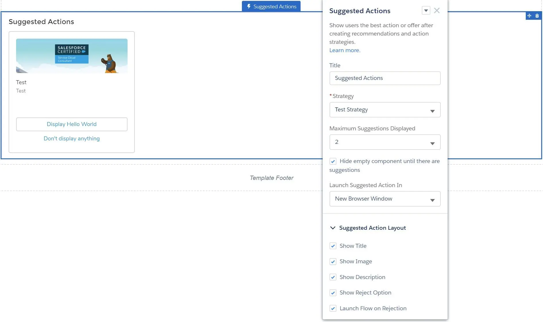
- Title
- Strategy
- Maximum Suggestions Displayed
- Hide empty component until there are suggestions
- Launch Suggested Action In
- New Browser Window
- Dialog Window
- Flow Page
- Suggested Action Layout
- Show Title
- Show Image
- Show Description
- Show Reject Option
- Launch Flow on Rejection
- Flow
- Records
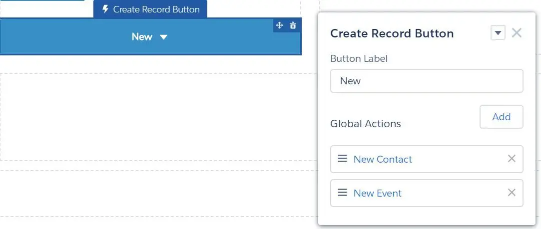
- Create Record Button
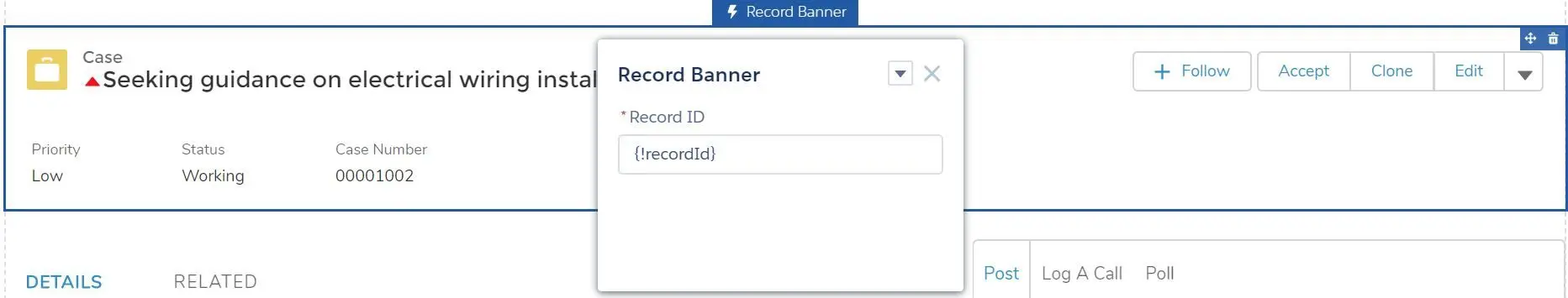
- Record Banner
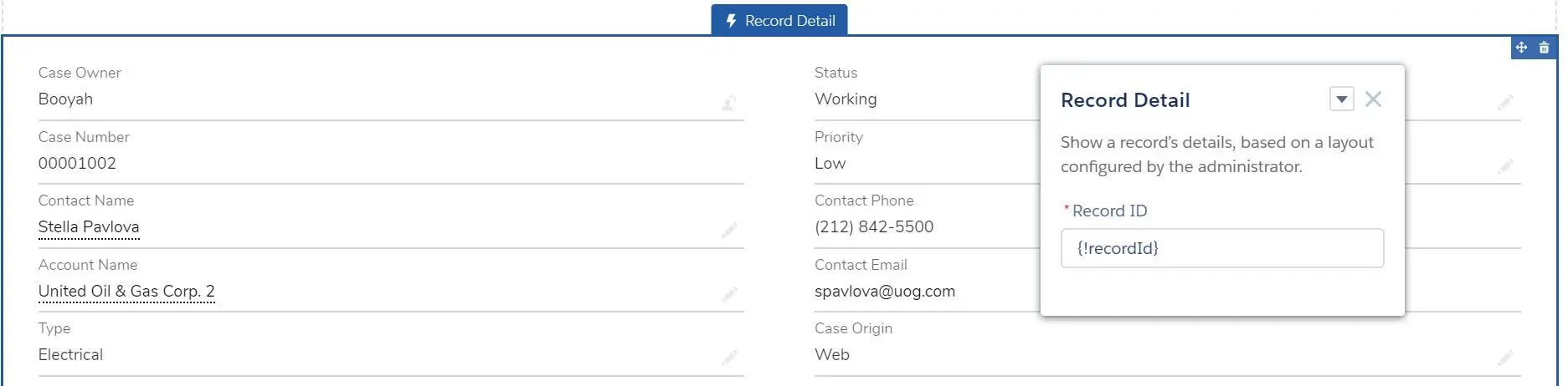
- Record Detail
- Record Information Tabs
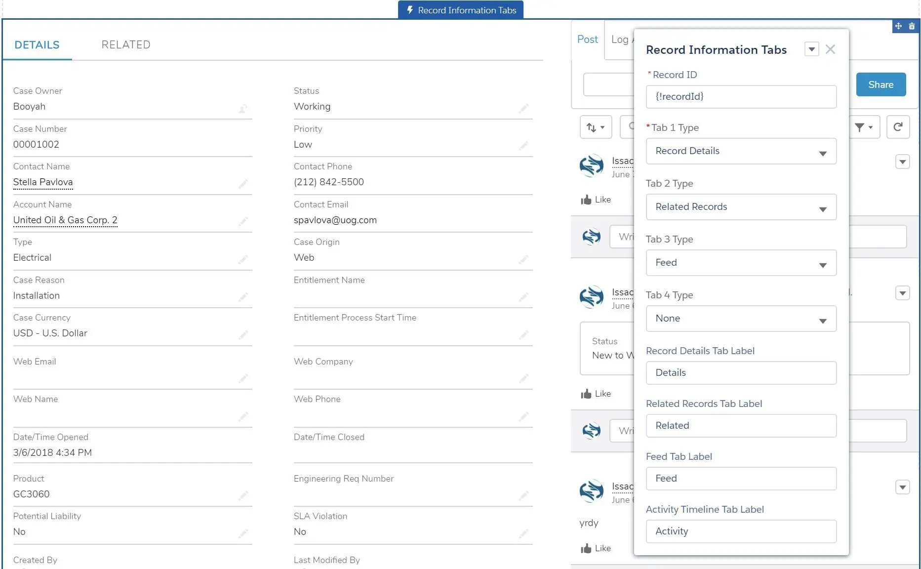
- Record ID
- Tab 1 Type (Record Details, Related Records, Feed, Activity Timeline, None)
- Tab 2 Type (same)
- Tab 3 Type (same)
- Tab 4 Type (same)
- Record Details Tab Label
- Related Records Tab Label
- Feed Tab Label
- Activity TImeline Tab Label
- NOTE: the last type will be displayed on the right column, if the selected components are more than 1.
- Record List
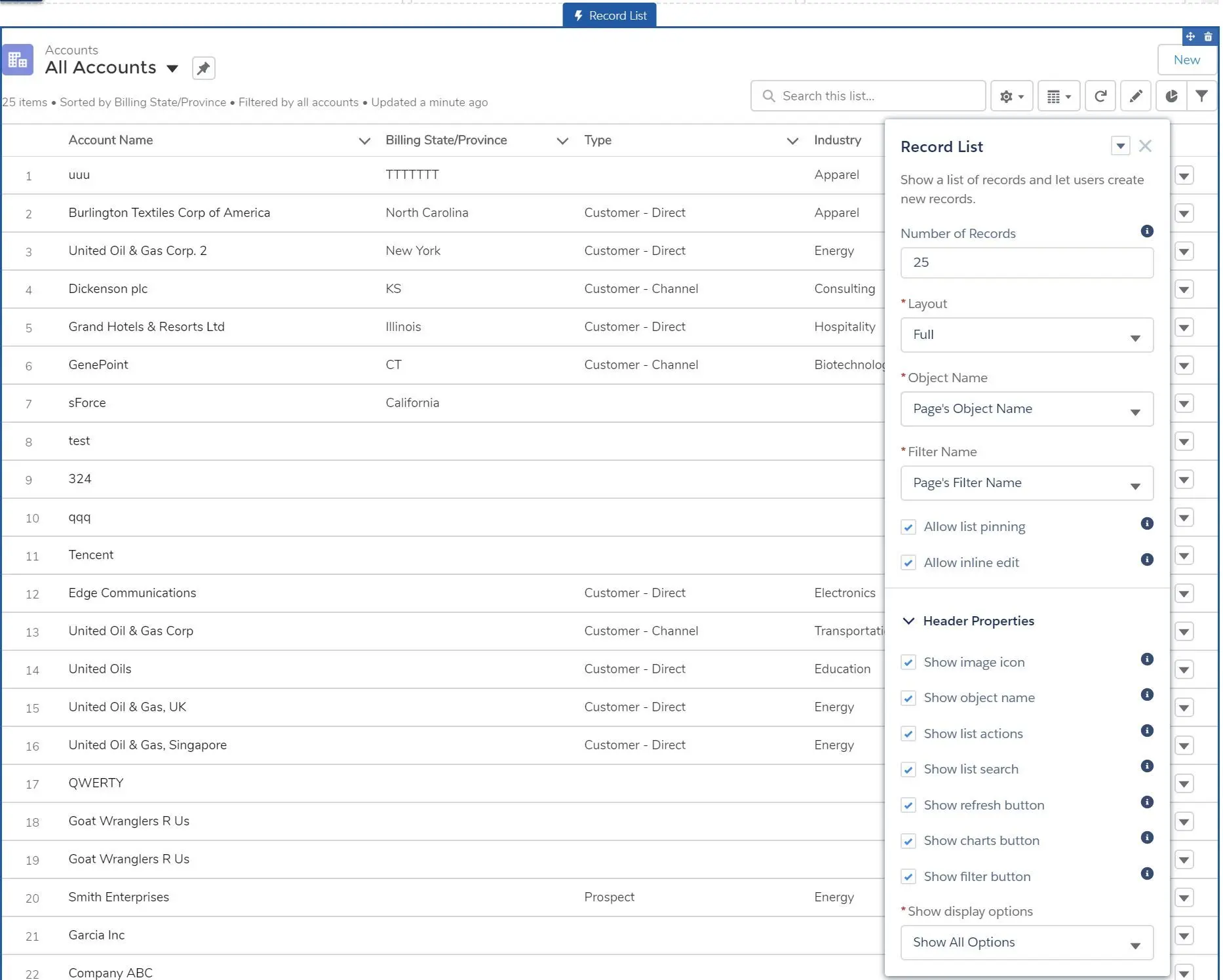
- Number of Records
- Layout (Full, Compact, Standard)
- Object Name (Page’s Object Name, Account, Case, Custom Object…)
- Filter Name (Page’s Filter Name, or object’s list view if selected)
- Allow list pinning (allow use pin a list view - in Full layout mode only)
- Allow inline edit (allow inline edit - in Full layout mode only, are no mix record type or unditable fields)
- Header Properties
- Show image icon
- Show object name
- Show list actions
- Show list search
- Show refresh button
- Show charts button
- Show filter button
- Show display options
- Show All Options
- Table Only
- Kanban Only
- Record Related List
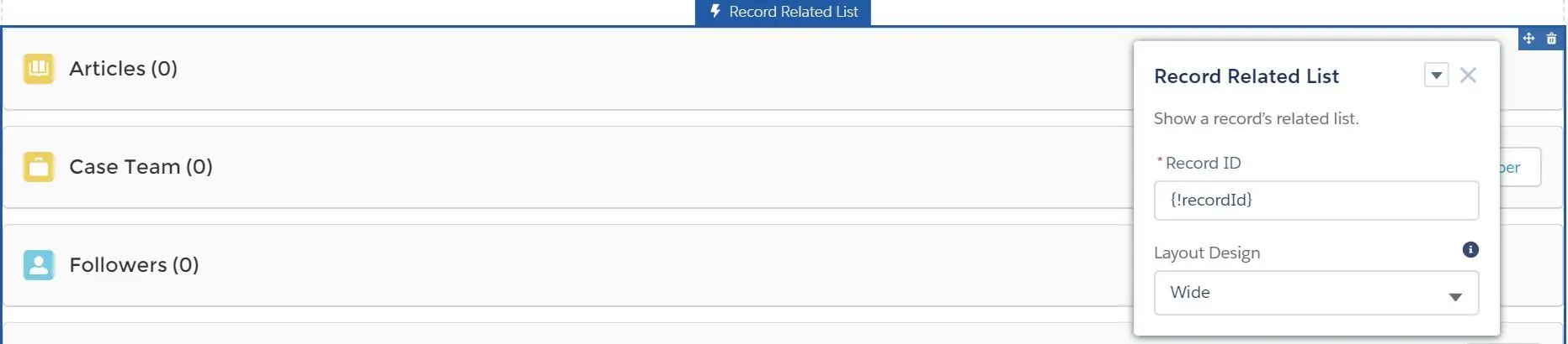
- Related Record List
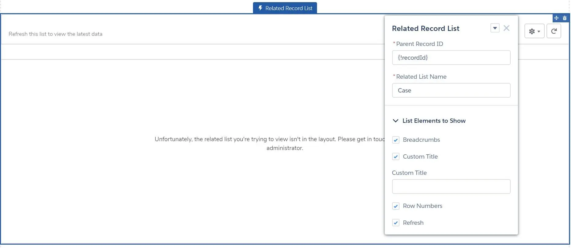
- Parent Record ID
- Related List Name
- List Elements to Show
- Breadcrumbs
- Custom Title
- Row Numbers
- Refresh
- Create Record Button
- Sales
- Activities
- Campaign Marketplace
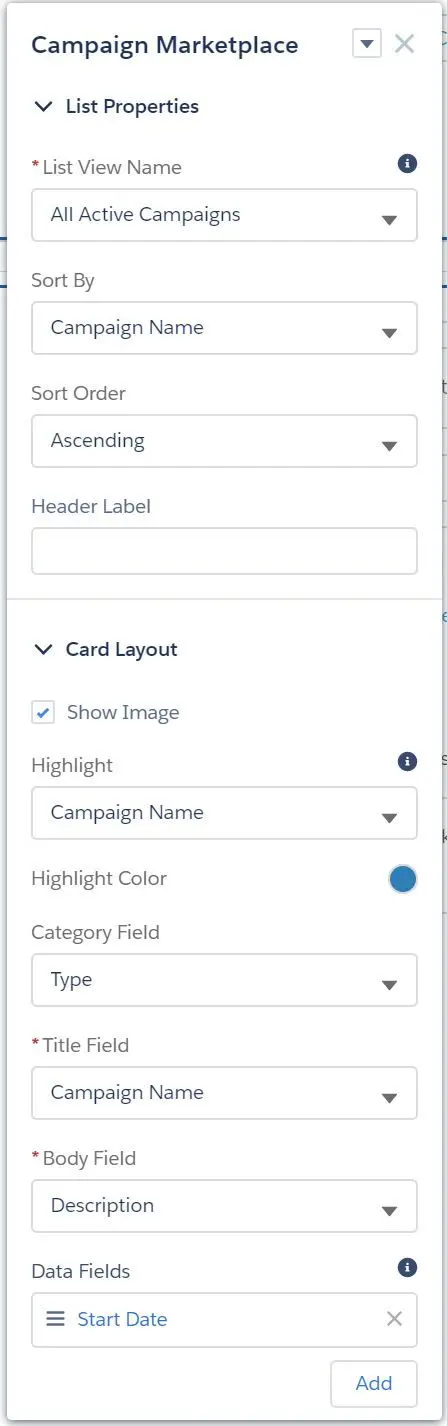
- List Properties
- List View Name (list views)
- Sort By (field)
- Sort Order (Ascending, Descending)
- Header Label
- Card Layout
- Show Image
- Highlight (field)
- Highlight Color
- Category Field (field)
- Title Field (field)
- Body Field (field)
- Data Fields (multiple)
- List Properties
- Lead Inbox
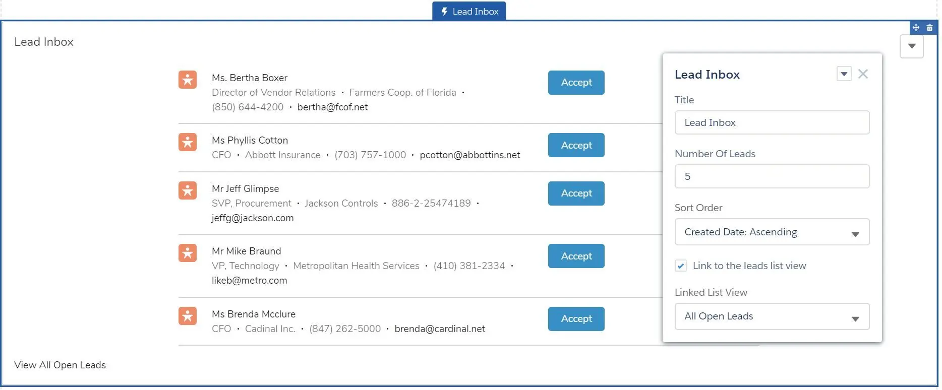
- Title
- Number of Leads
- Sort Order (Created Date Ascending, Created Date Descending)
- Link to the lead list view
- Linked List View (list views)
- Activities
- Support
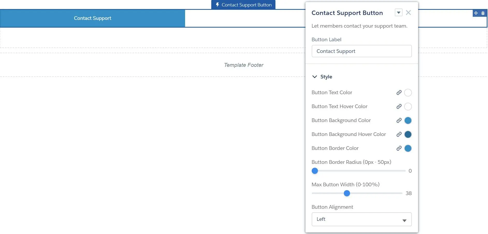
- Ask Button
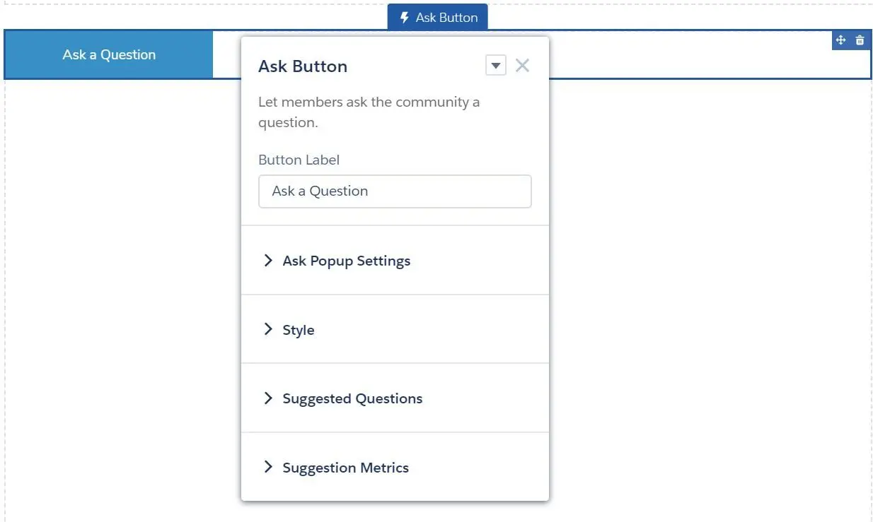
- Button Label
- Ask Popup Settings
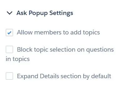
- Allow members to add topics
- Block topic selection on questions in topics
- Expand Details section by default
- Style
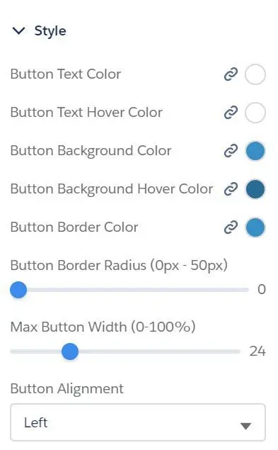
- Button Text Color
- Button Text Hover Color
- Button Background Color
- Button Background Hover Color
- Button Border Color
- Button Border Radius (0px - 50px)
- Max Button Width (0% - 100%)
- Button Alignment (Left, Center, Right)
- Suggested Questions
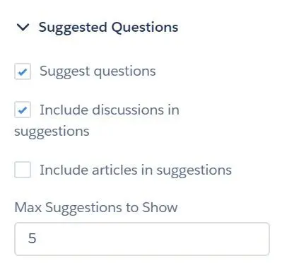
- Suggest questions
- Include discussions in suggestions
- Include articles in suggestions
- Max Suggestions to Show
- Suggestion Metrics
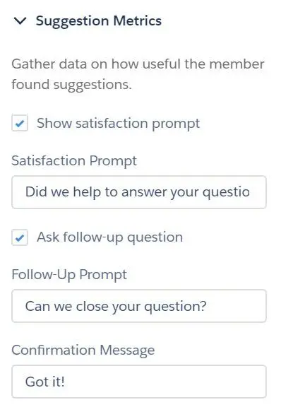
- Show satisfaction prompt
- Satisfaction Prompt
- Ask follow-up question
- Follow-up Prompt
- Confirmation Message
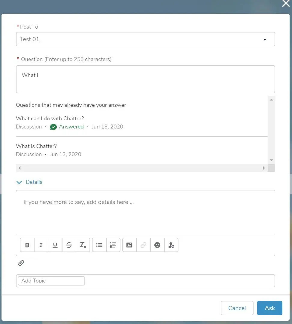
- Ask a question with displays of suggested questions, articles or discussion:
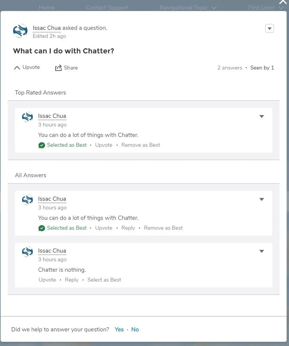
- Suggest the answered question and show satisfaction prompt, asking if we help answering the question and ask to close the question:
- Ask Button
- Case Deflection
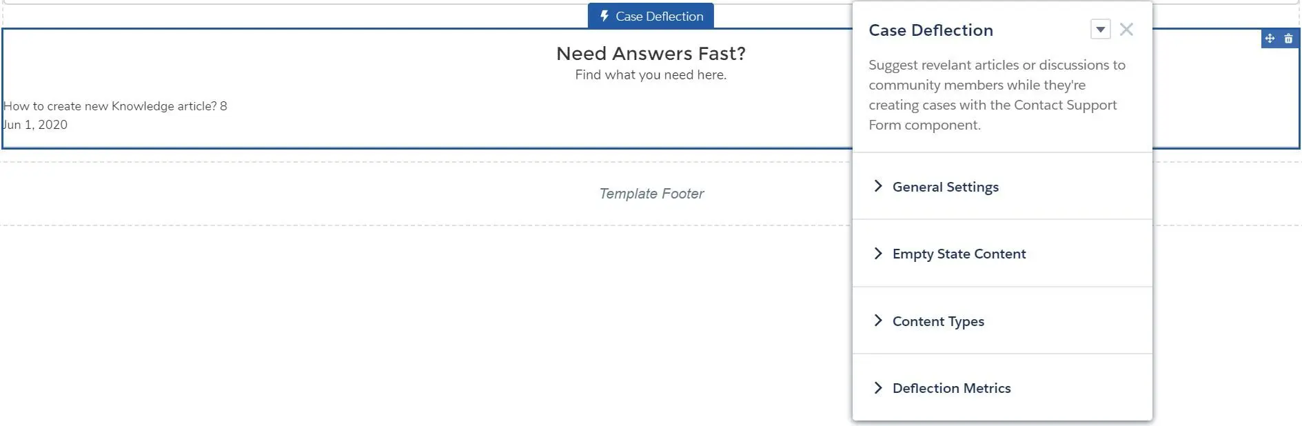
- General Settings
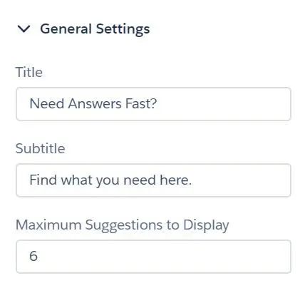
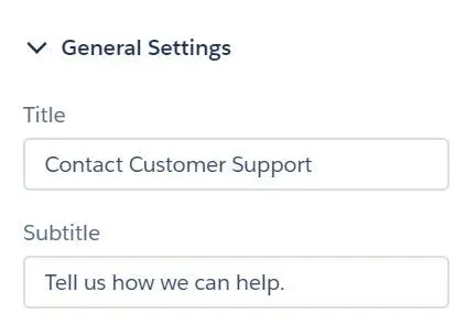
- Title
- Subtitle
- Maximum Suggestions to Display
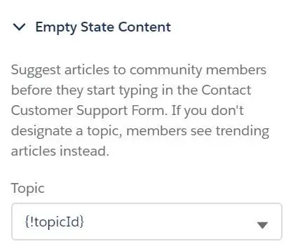
- Empty State Content (if topic not set, it will display trending articles)
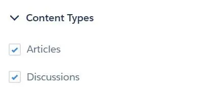
- Content Types
- Deflection Metrics
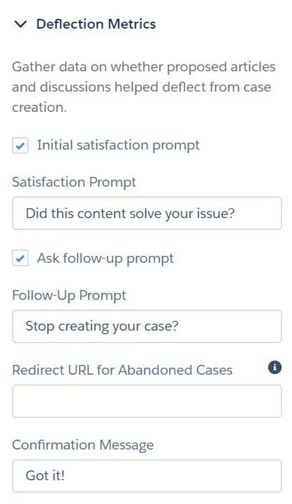
- Initial satisfaction prompt
- Satisfaction Prompt
- Ask follow-up prompt
- Follow-Up Prompt
- Redirect URL for Abandoned Cases
- Confirmation Message
- General Settings
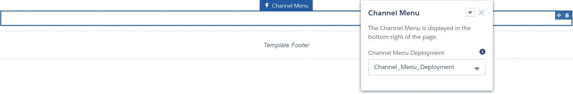
- Channel Menu
- Contact Request Button & Flow
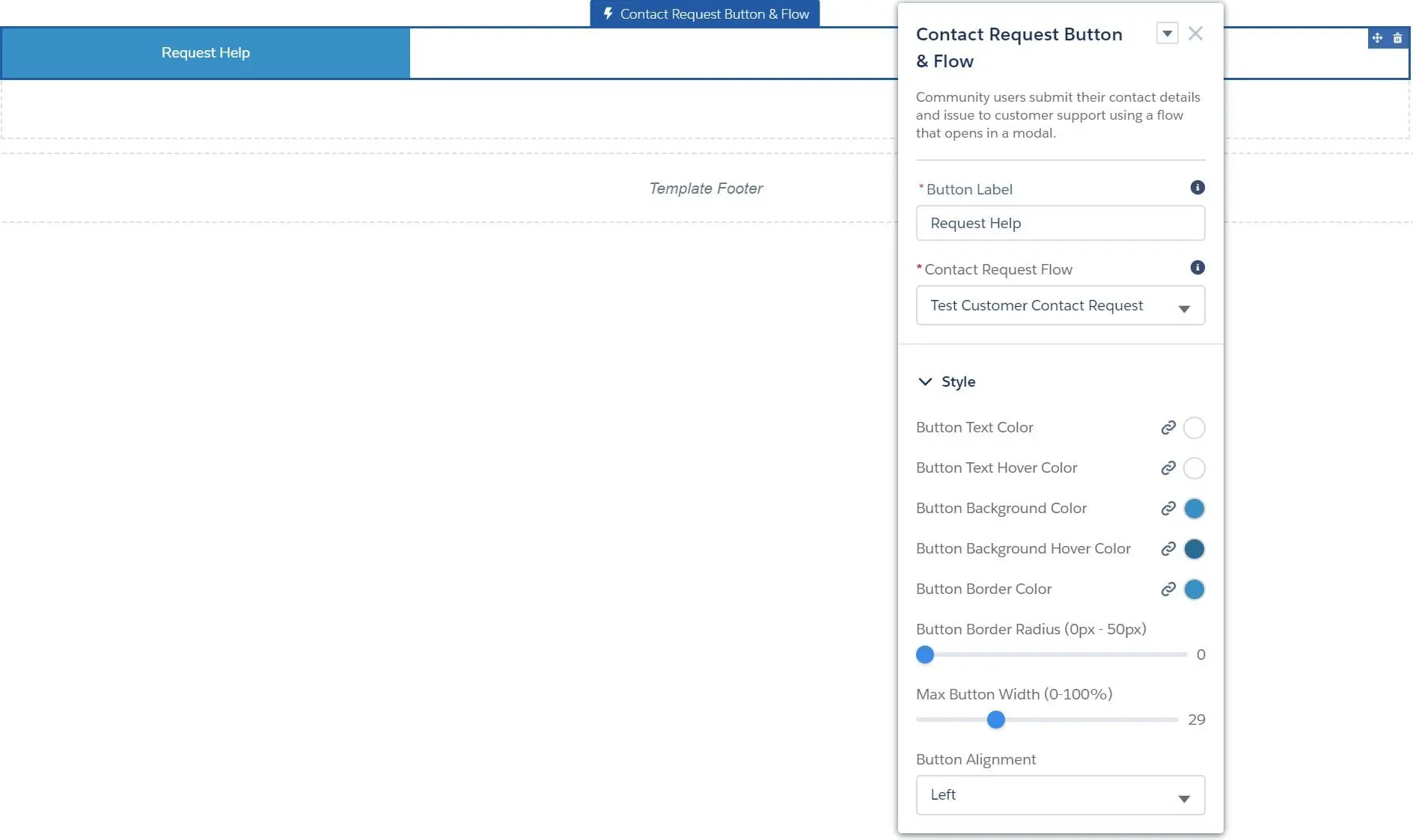
- Button Label
- Contact Request Flow (search the flow at
Setup > Customer Contact Requests) - Style
- Button Text Color
- Button Text Hover Color
- Button Background Color
- Button Background Hover Color
- Button Border Color
- Button Border Radius (0px - 50px)
- Max Button Width (0% - 100%)
- Button Alignment (Left, Center, Right)
- Contact Support & Ask Buttons
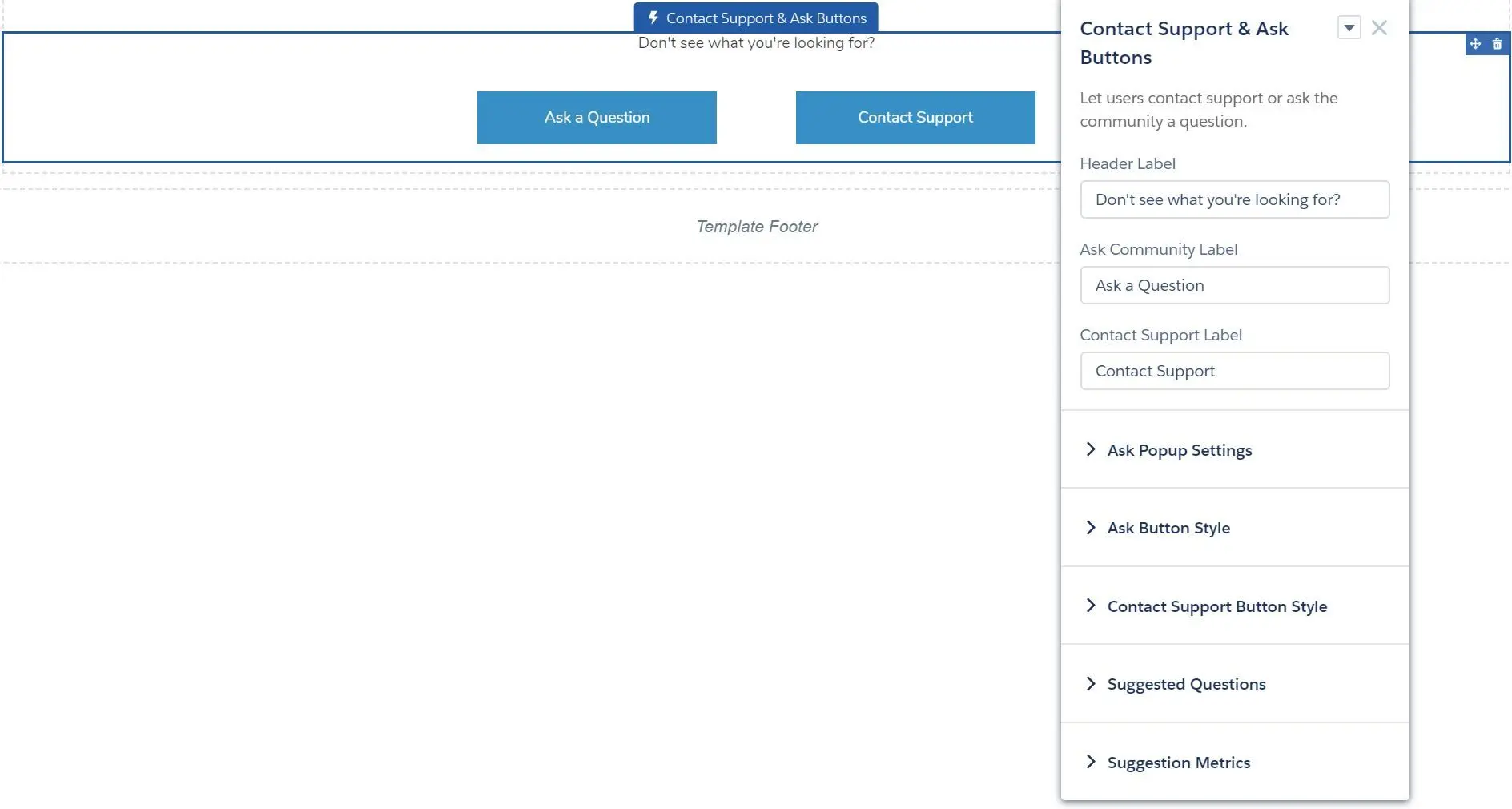
- Header Label
- Ask Community Label
- Contact Support Label
- Ask Popup Settings
- Ask Button Style
- Contact Support Button Style
- Suggested Questions
- Suggestion Metrics
- Contact Support Button
- Contact Support Form
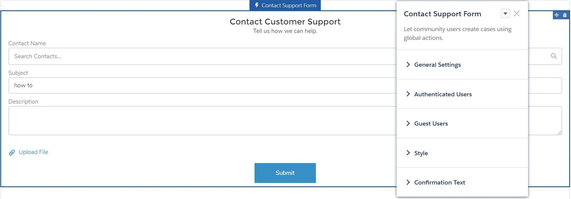
- General Settings
- Authenticated Users
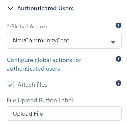
- Global Action (create case)
- Attach files
- File Upload Button Label
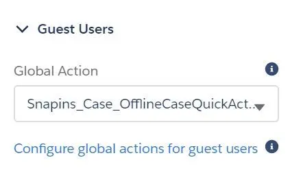
- Guest Users
- Style
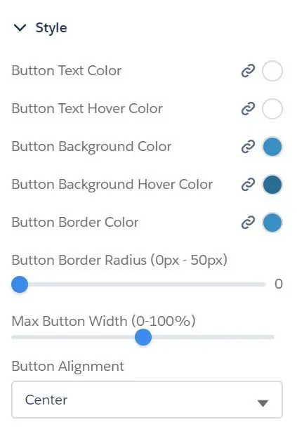
- Button Text Color
- Button Text Hover Color
- Button Background Color
- Button Background Hover Color
- Button Border Color
- Button Border Radius (0px - 50px)
- Max Button Width (0% - 100%)
- Button Alignment (Left, Center, Right)
- Confirmation Text
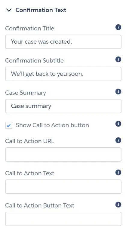
- Confirmation Title
- Confirmation Subtitle
- Case Summary
- Show Call to Action button
- Call to Action URL
- Call to Action Text
- Call to Action Button Text
- General Settings
- Create Case Form
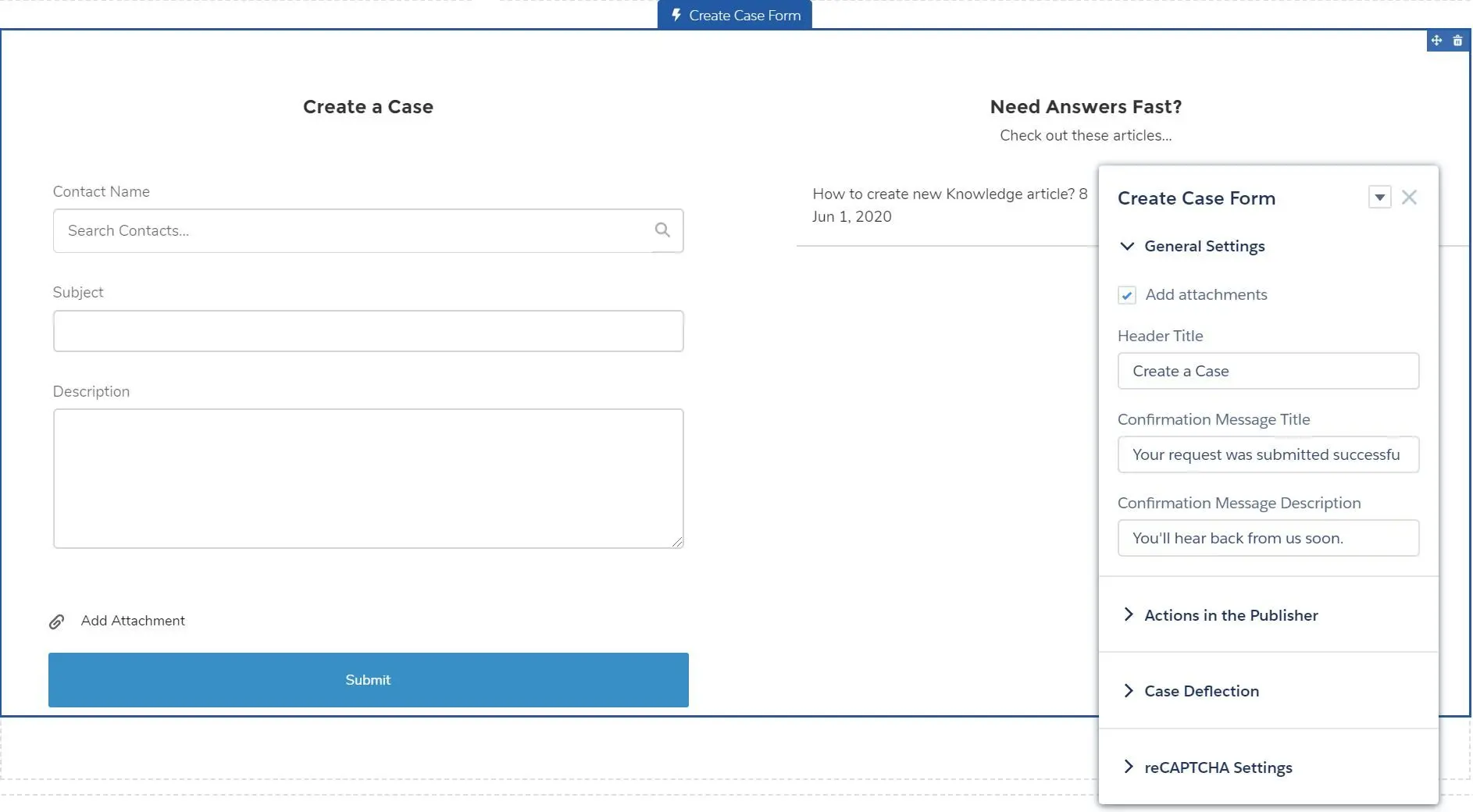
- Add attachments
- Header Title
- Confirmation Message Title
- Confirmation Message Description
- Actions in the Publisher
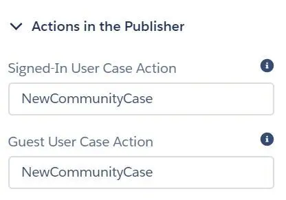
- Signed-In User Case Action (global action API name)
- Guest User Case Action (global action API name)
- Case Deflection
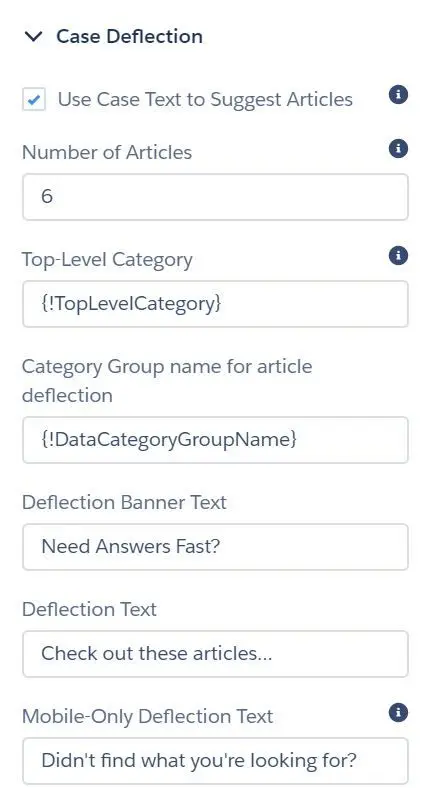
- Use Case Text to Suggest Articles (type text to suggest articles)
- Number of Articles
- Top-Level Category (top category for templates that use data categories)
- Category Group name for article deflection
- Deflection Banner Text
- Deflection Text
- Mobile-Only Deflection Text
- reCAPTCHA Settings
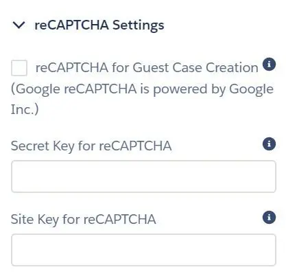
- reCAPTCHA for Guest Case Creation
- Secret Key for reCAPTCHA
- Site Key for reCAPTCHA
- Embedded Service Appointments
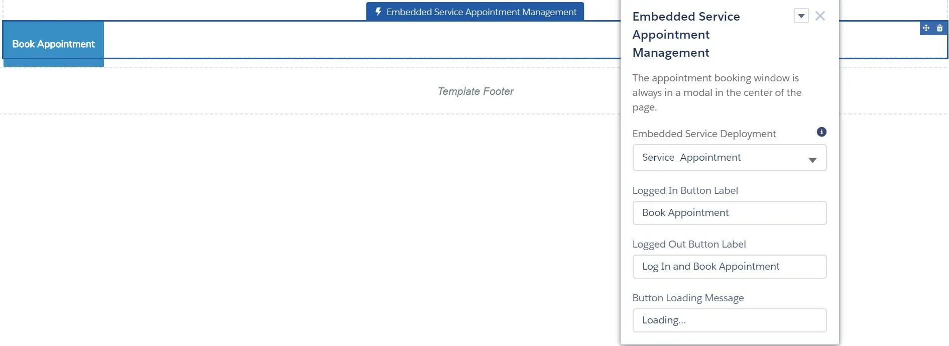
- Embedded Service Deployment
- Logged In Button Label
- Logged Out Button Label
- Button Loading Message
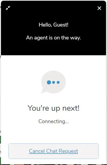
- Embedded Service Chat
- Chat Deployment
- Display chat button
- Fill in pre-chat fields
- Button Label
- Offline Button Label
- Offline Support Button Label
- Chat Waiting Message
- Chat Waiting Background Image URL
- Agent Avatar Image URL
- Pre-Chat Background Image URL
- Company Logo URL
- Routing Order
- Snippet Settings File
- External Scripts
- External Styles
- Storage Domain
- Survey
- Surveys
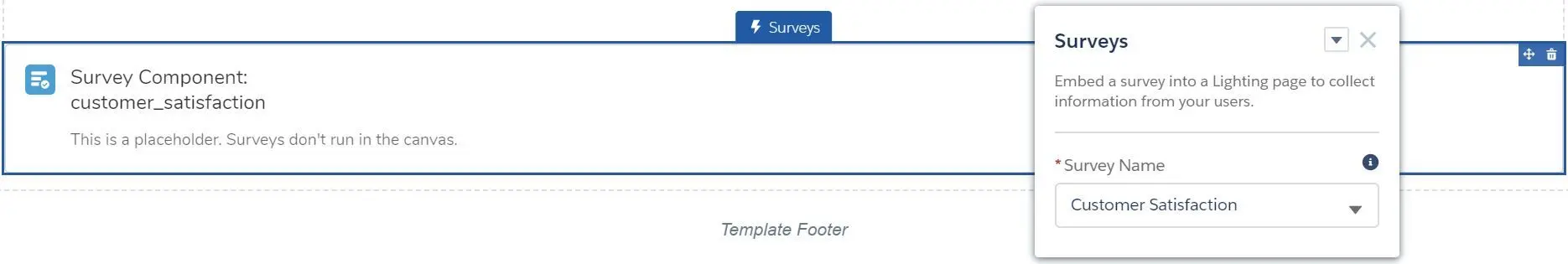
- Survey Name
- NOTE: please make sure you have enabled survey in
Setup > Survey Settings:
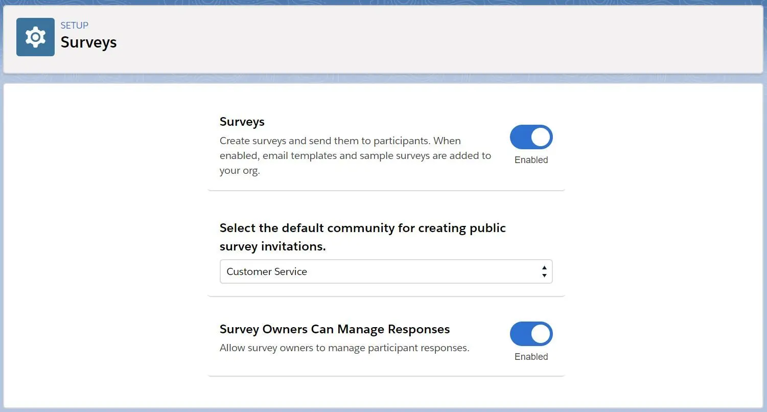
- Surveys
- Topics
- Featured Topics
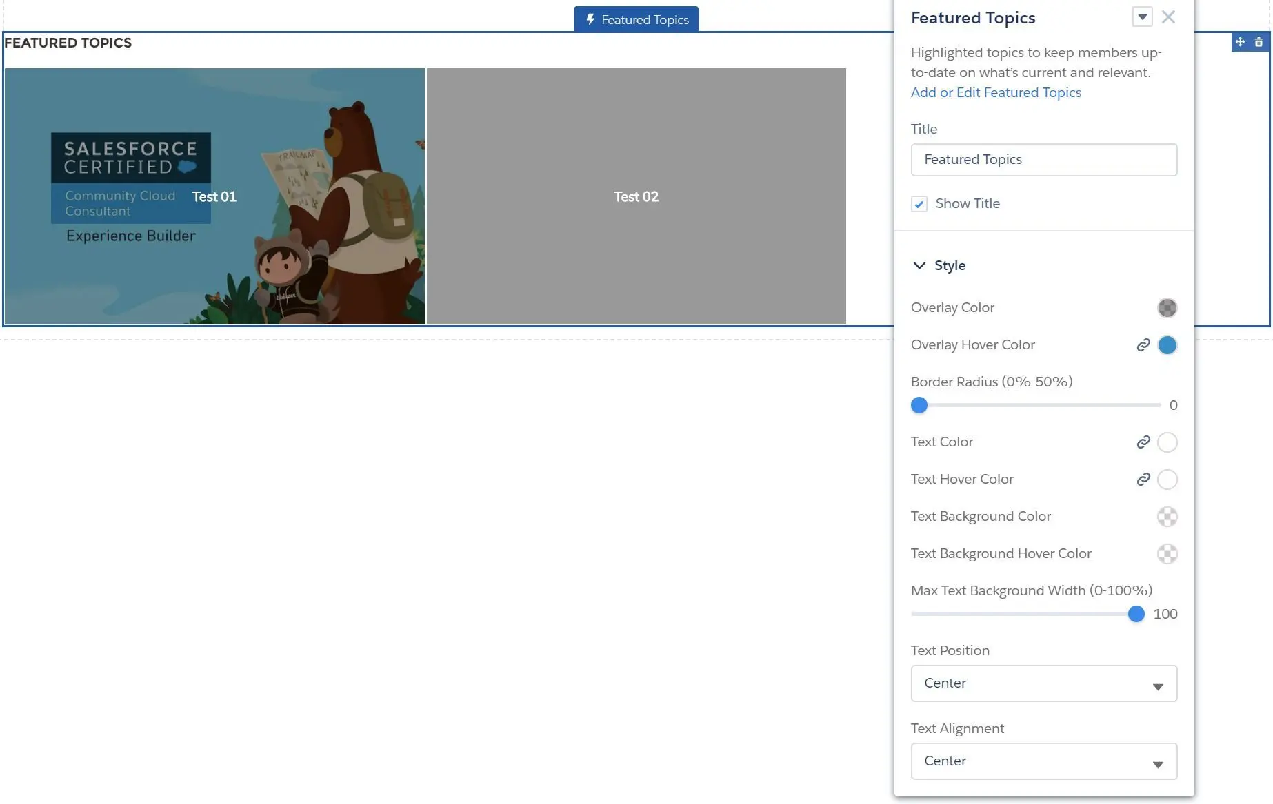
- Title
- Show Title
- Style
- Overlay Color
- Overlay Hover Color
- Border Radius (0% - 50%)
- Text Color
- Text Hover Color
- Text Background Color
- Text Background Hover Color
- Max Text Background Width (0% - 100%)
- Text Position (Left, Center, Right)
- Text Alignment (Left, Center, Right)
- Top Articles by Topic
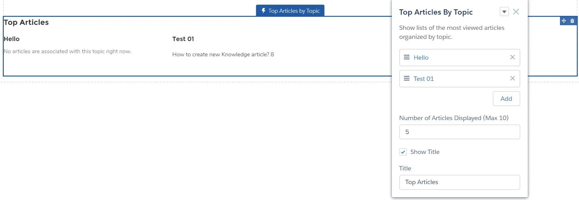
- Add topic
- Number of Articles Displayed (Max 10)
- Show Title
- Title
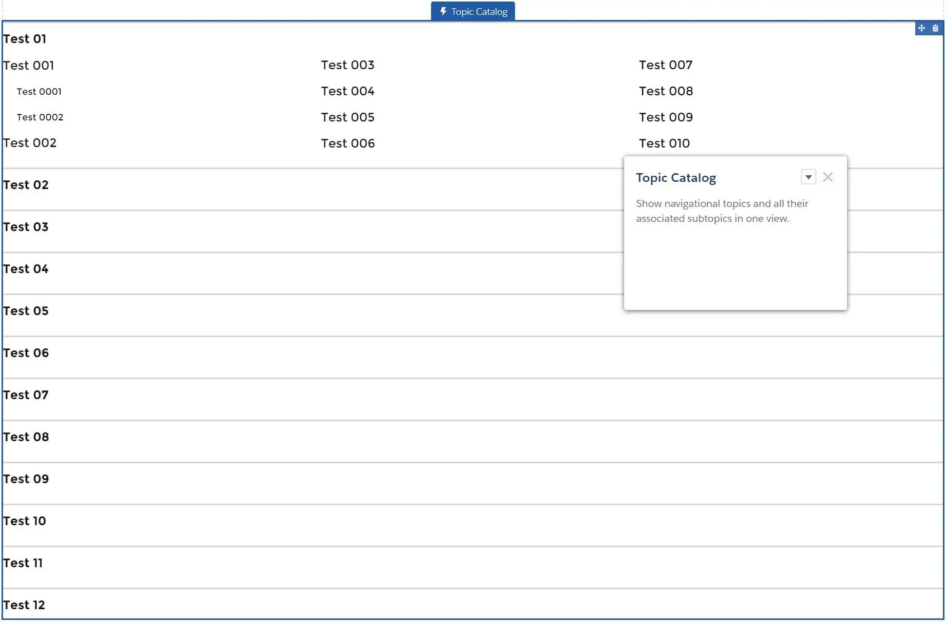
- Topic Catalog
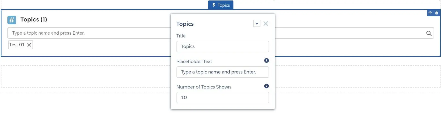
- Topics
- Trending Articles by Topics
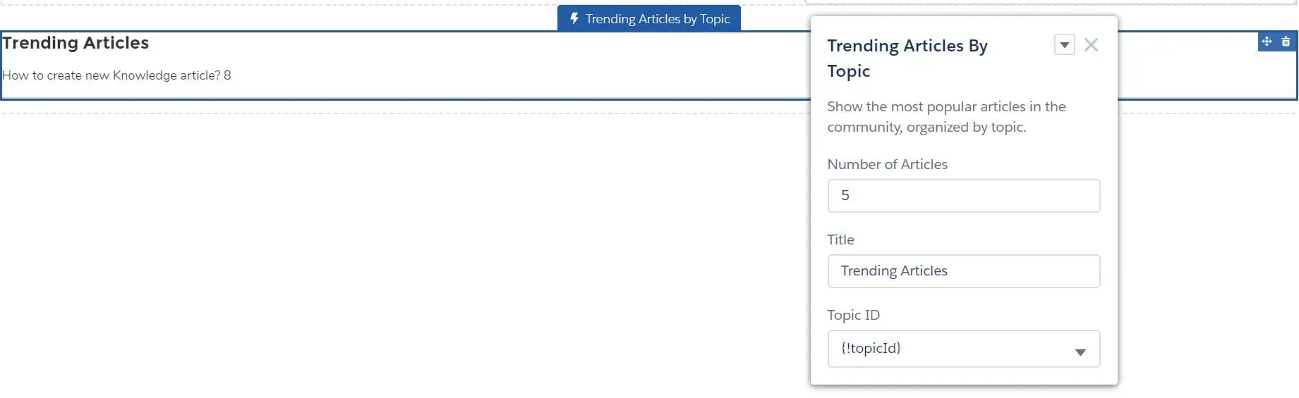
- Number of Articles
- Title
- Topic ID (
{!topicId}, or any created topic)
- Trending Topics
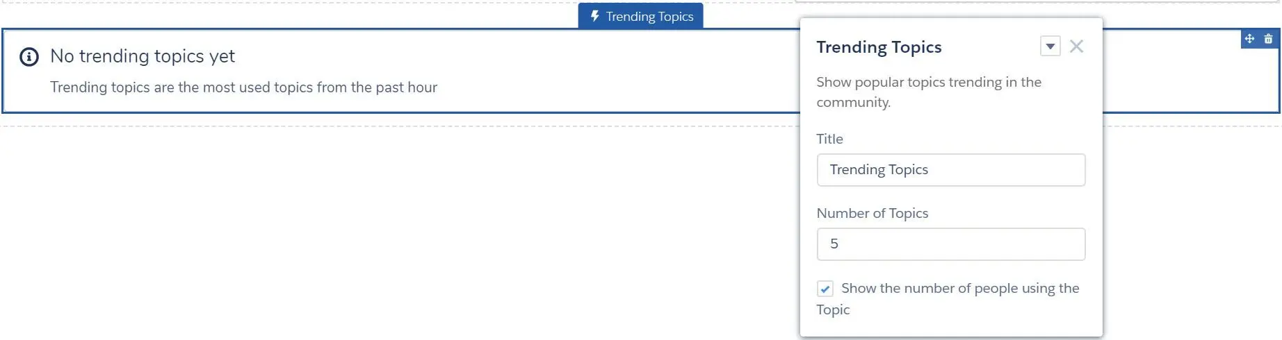
- Title
- Number of Topics
- Show the number of people using the Topic
- Featured Topics
- Missing components from the list (will add when have time):
- Analytics:
- Report List
- Report Summary
- Articles:
- Article Content
- Cases:
- Case Comments Publisher
- Set Case Status Button
- Feeds:
- Feed Posts & Comments
- Follow Button
- Stream Detail
- Stream List
- Gamification:
- Recognition Badges Related List
- Sales:
- Account Brand Details
- Search:
- Global Search Results
- Search Results
- Support:
- Deflection Tracking
- Records:
- Event Insights
- Path
- Related List - Single
- Topics:
- Topic Metrics
- User Profile:
- Customizable User Settings
- Member Profile and Settings
- User Profile
- User Profile Detail
- User Profile Image
- User Profile Knows About
- User Profile Related List
- User Profile Stats
- User Profile Summary
- User Profile Summary & …
- User Profile Tabs
- User Settings
- Groups:
- Announcement Section
- Group
- Group Banner
- Group Detail
- Group Related List
- Manage Members Section
- Messages:
- Messages List
- Navigation:
- Breadcrumbs
- Analytics:
- Show all components can be enabled in
Experience Builder > Settings > Advanced: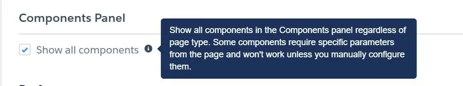
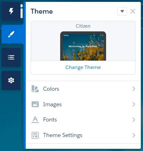
Theme
- Manage Branding Sets:
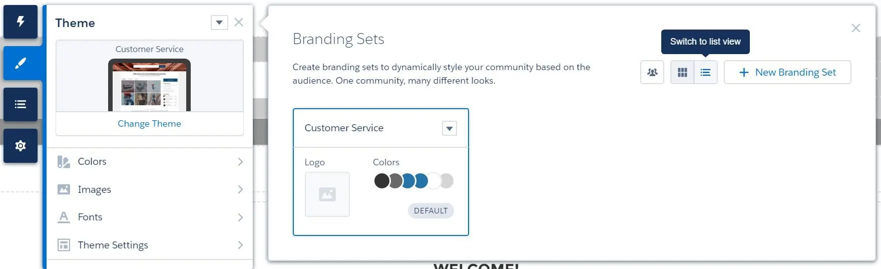
- Different branding sets can be created for different target audience.
- New audience can be defined to specify your target audience:
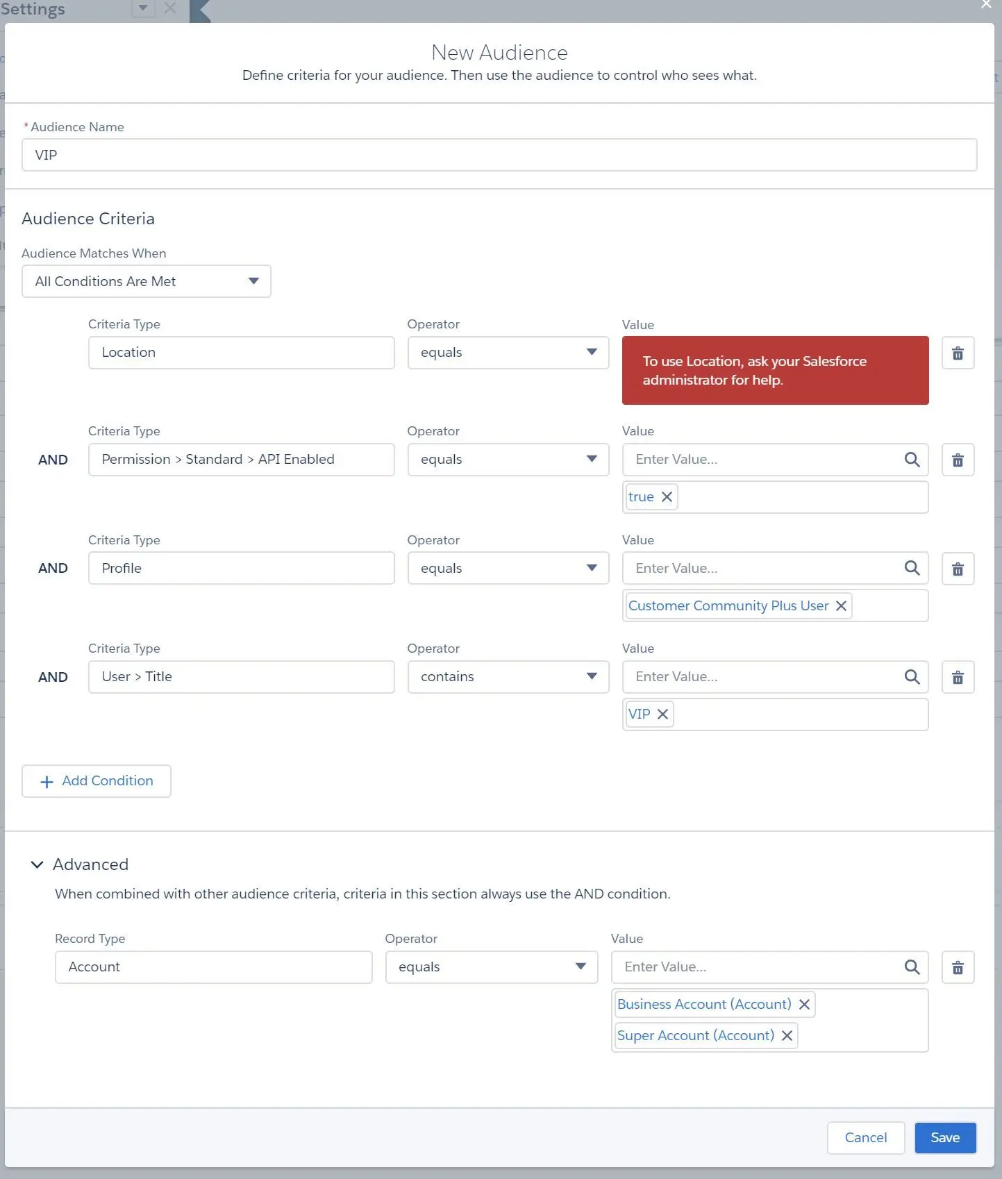
- Audience Criteria can be defined:
- Location
- Permission
- Profile
- User
- Advanced criteria can be set as well
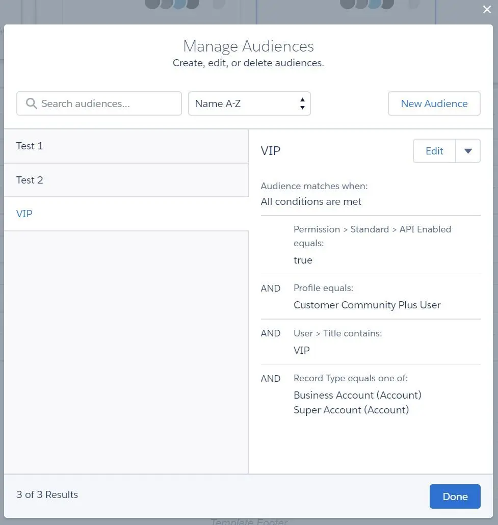
- View and manage the audience:
- Assign audience to Branding Set:
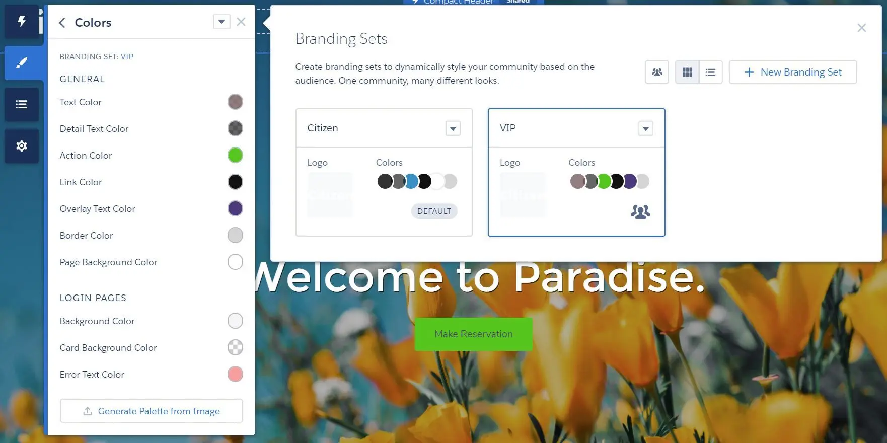
- NOTE: default branding set cannot be removed and it must be there for users that are not part of an audience.
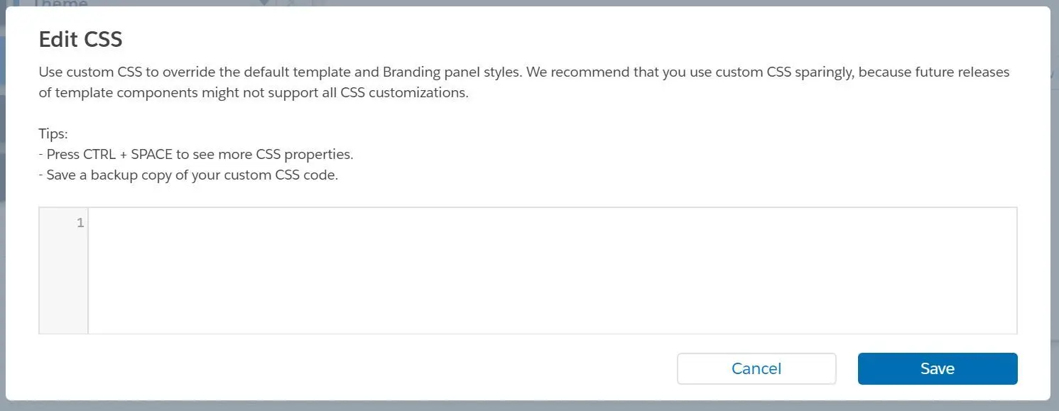
- Use custom CSS to spice up the community a little bit:
- Colors:
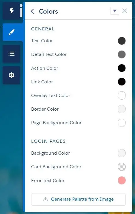
- Colors can also be automatically set by using Generate Palette from Image.
- Images:
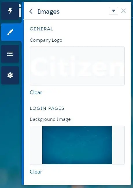
- Company Logo
- Login Page Background Image
- Fonts:
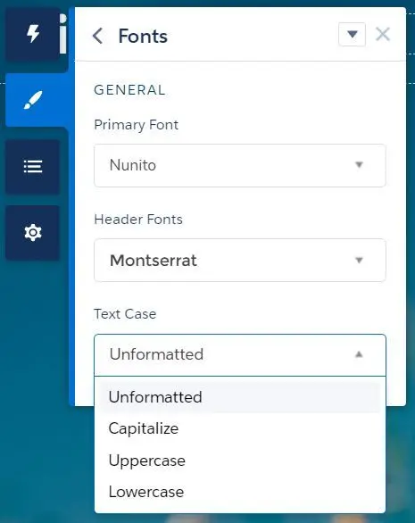
- Font types and text case can be set.
- Theme Settings:
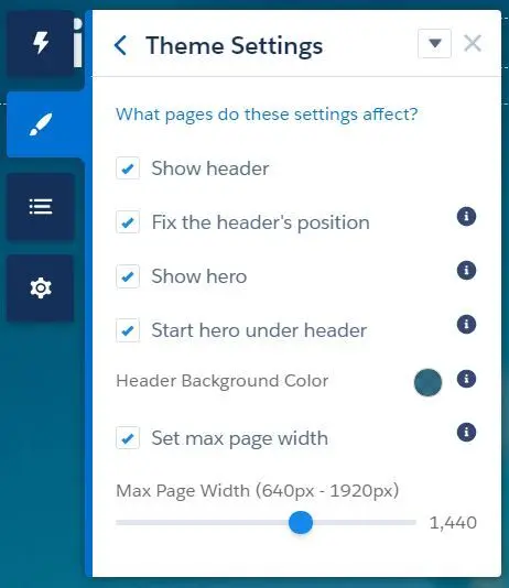
- Show header
- Fix the header’s position - header will be sticked to the top
- Show hero - hero is useful for promoting search, content, and actions
- Start hero under header - consider using transparent background color for the header if enabled
- Set max page width (640px - 1920px)
- Show header
Navigation Menu
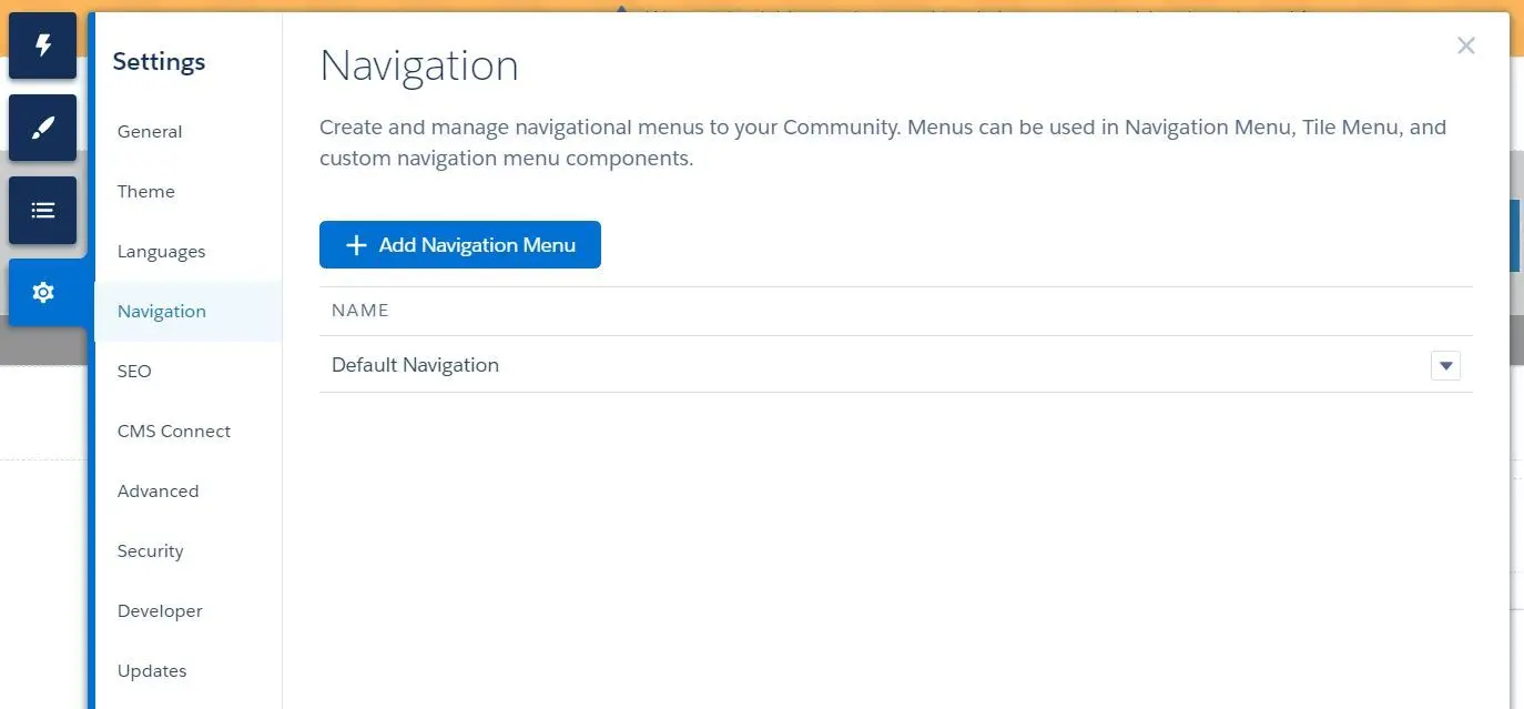
- Navigation Menu can be created in
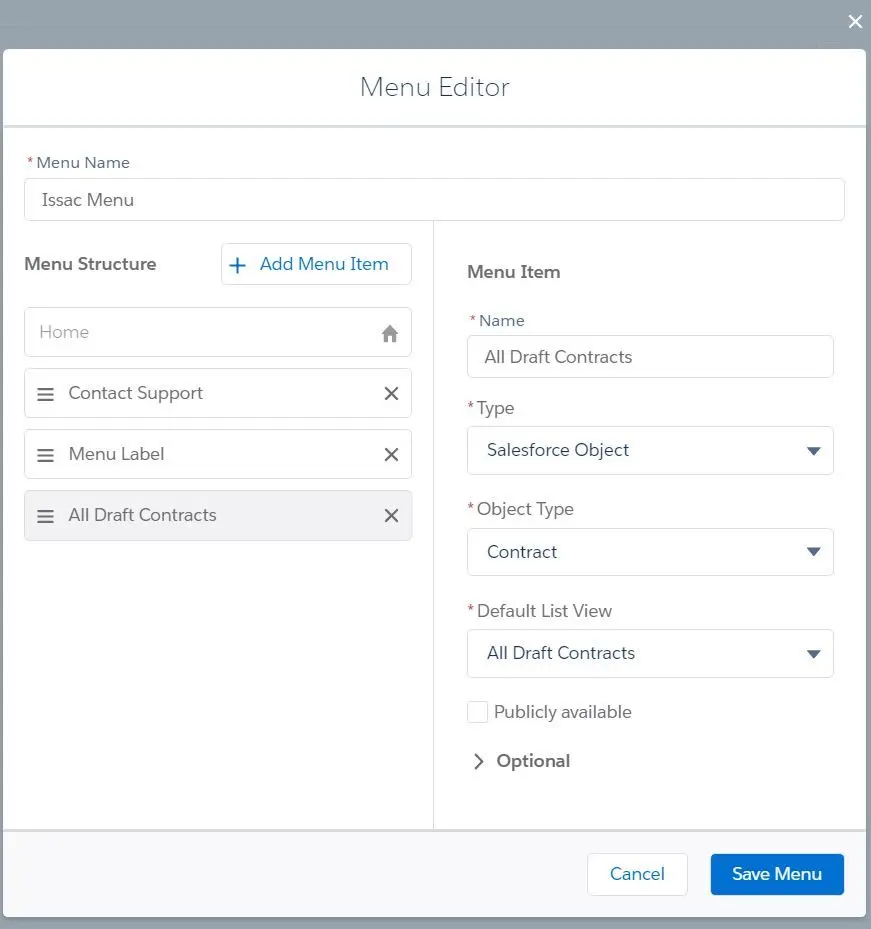
Experience Builder > Settings > Navigation. - Navigation Menu and Menu Items can be set and customized:
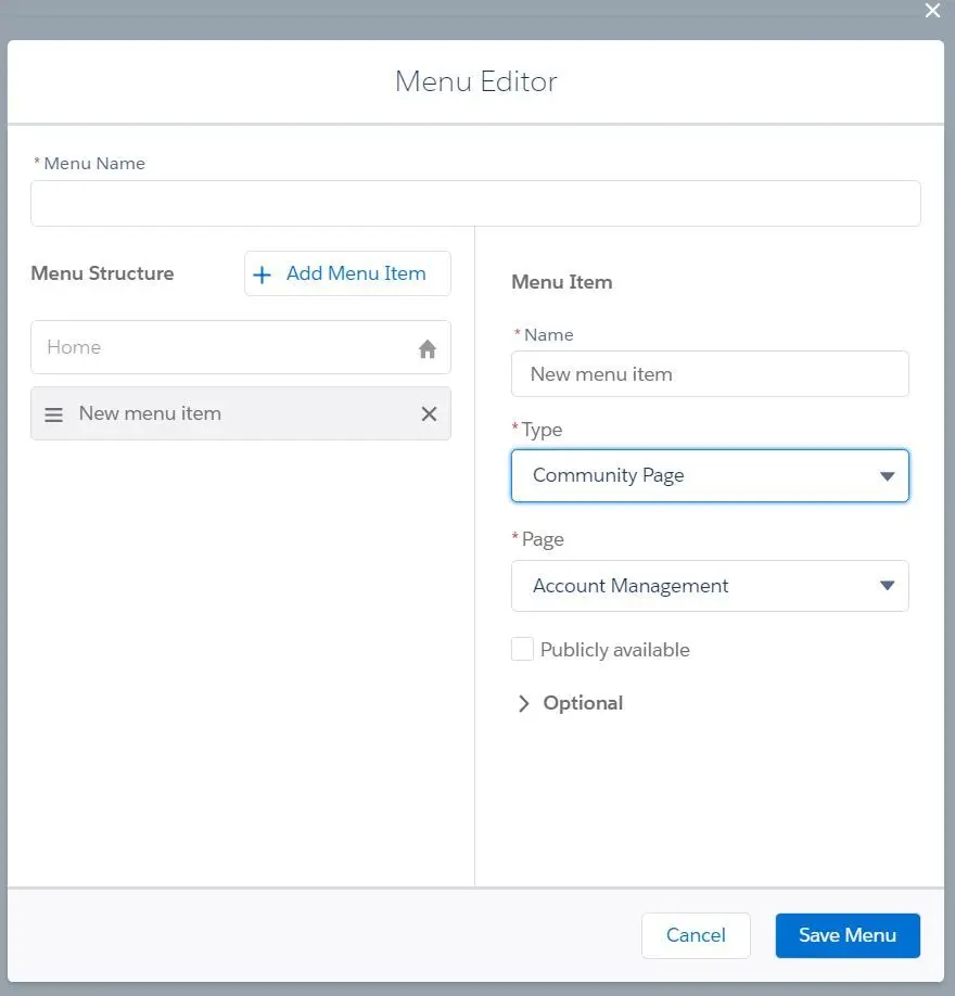
- Menu Item can be type of:
- Community Page
- a page within the community
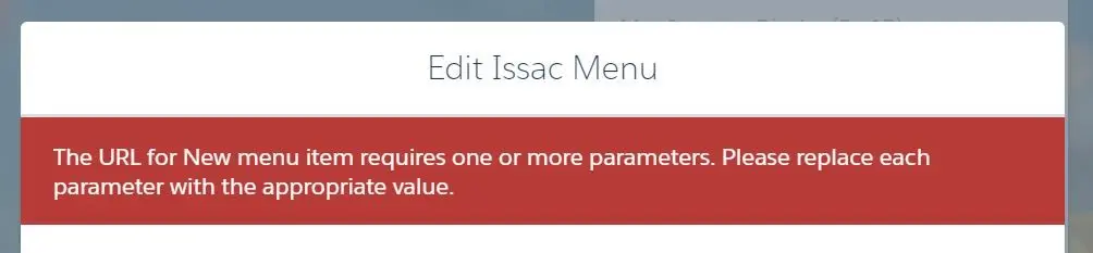
- NOTE: page that requires specific parameters, ex:
:objectApiName,:filterName, etc. will not be able to add on navigation menu
- External URL
- option to Open link in the same tab
- Global Action
- global action, ex: create new record
- Menu Label
- can be used as sub-menus
- NOTE: you
- Navigational Topic
- option to add the “More Topics…” link
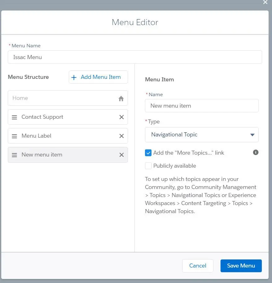
- NOTE: Navigational Topic cannot be nested under Menu Label.
- option to add the “More Topics…” link
- Salesforce Object
- select an object with default list view
- option to select the object type
- option to select default list view
- Community Page
- All options can set to be publicly available
- All options can set an image on tile menus (125px x 340px)
- Menu Item can be type of:
- Navigation Menu options:
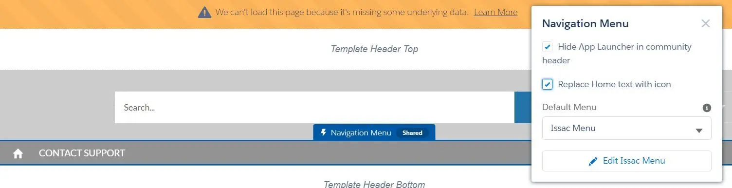 -Hide App Launcher
- Replace Home text with icon
- Choose the default menu
- Replace Home text with icon
Community Page
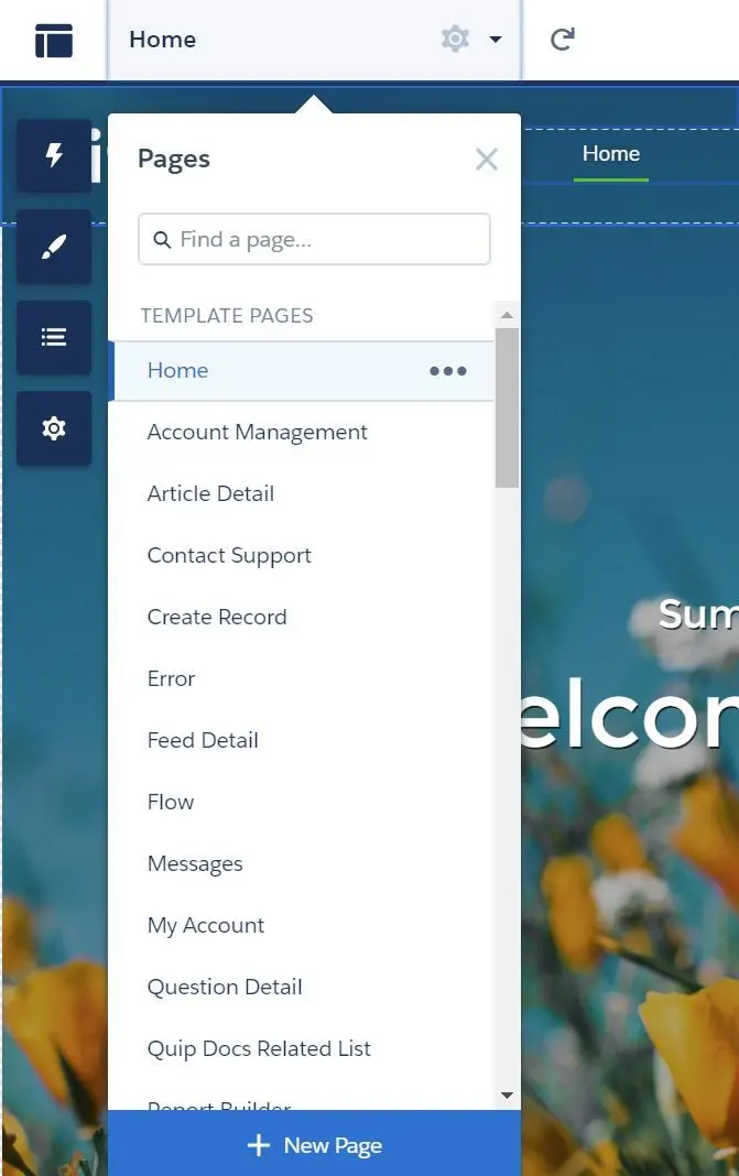
- Page can be accessed in Pages Menu and clicking on the 3 dots to view the properties and page variations:
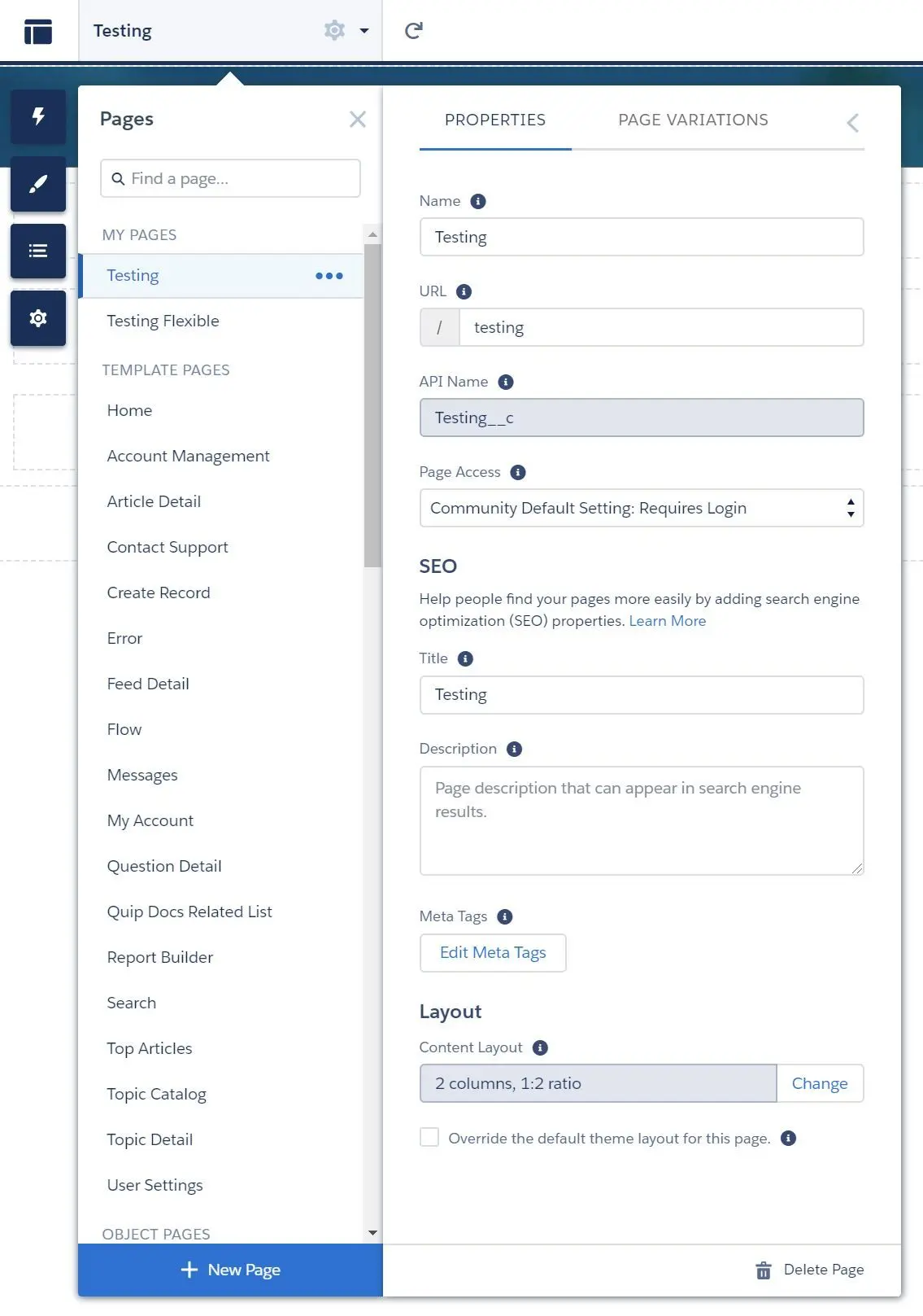
- Name and URL can be set
- API Name cannot be modified once the page is created.
- NOTE: API Name will be automatically appended with
__c
- NOTE: API Name will be automatically appended with
- Page Access can be set as well:
- Community Default Setting
- Requires login
- Public
- SEO title and description as well as custom meta tags can be set.
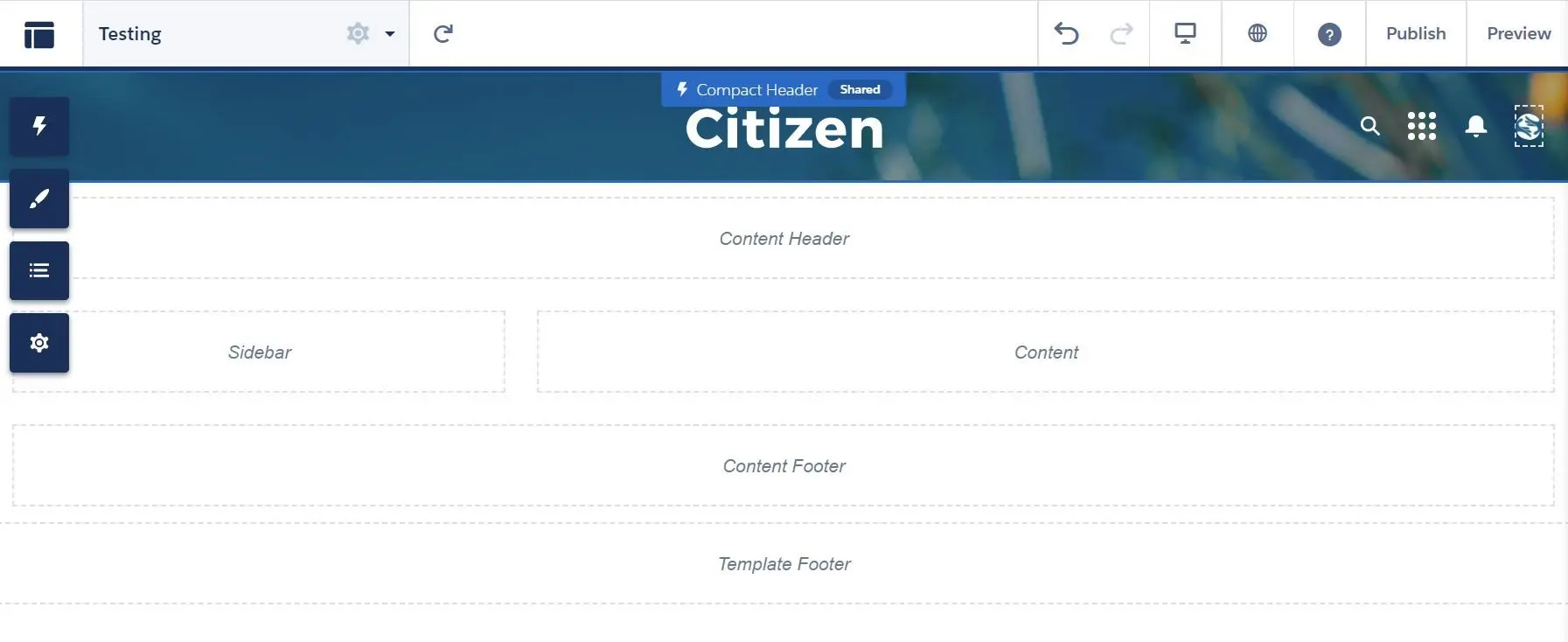
- Page layout can be changed.
- The default theme layout for this page can be overridden by selecting
Override the default theme layout for this pageoption.
- Page Variation can be used to target different audience:
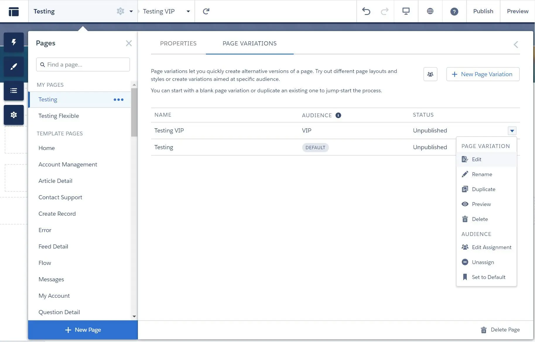
- New Page Variation with same URL can be created:
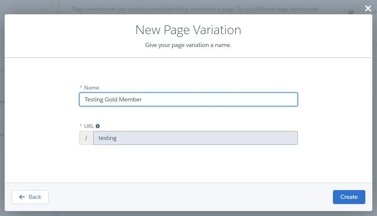
- You can do the following on the newly created or existing page variations:
- Edit
- Rename
- Duplicate
- Preview
- Delete
- Assign
- Set to Default
- NOTE: Changes must be published in order to apply to communities.
- Create new page steps:
- Navigate to Pages menu and click on New Page
- Select New Page Type:
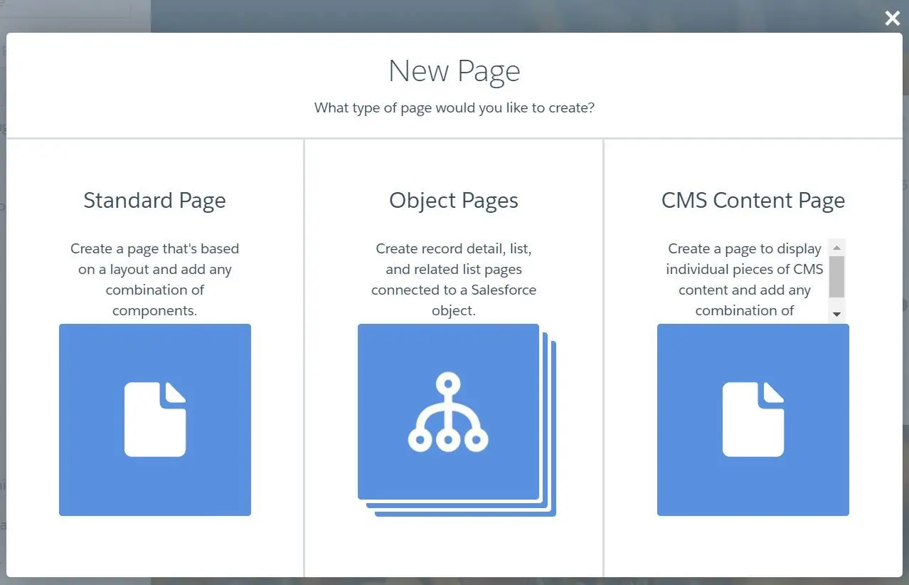
- Standard Page
- Object Page
- Select the object:
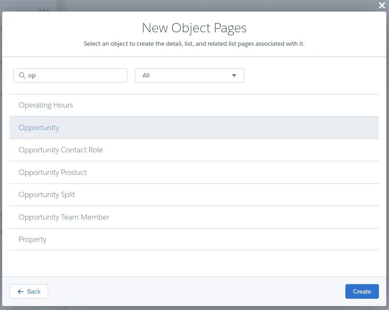
- When creating object page, the following page will be created as well:
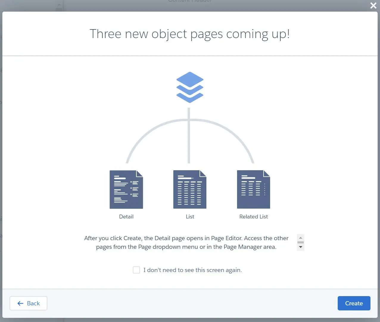
- Object Detail Page
- Record Banner and Record Information Tabs component will be added onto the page
- Object List
- Record List will be added onto the page
- Object Related List
- Object Related List will be added onto the page
- Object Detail Page
- NOTE: If the object page is created before, you can’t create again.
- Select the object:
- CMS Content Page
- (Standard Page) Create New Blank Page and select page layout:
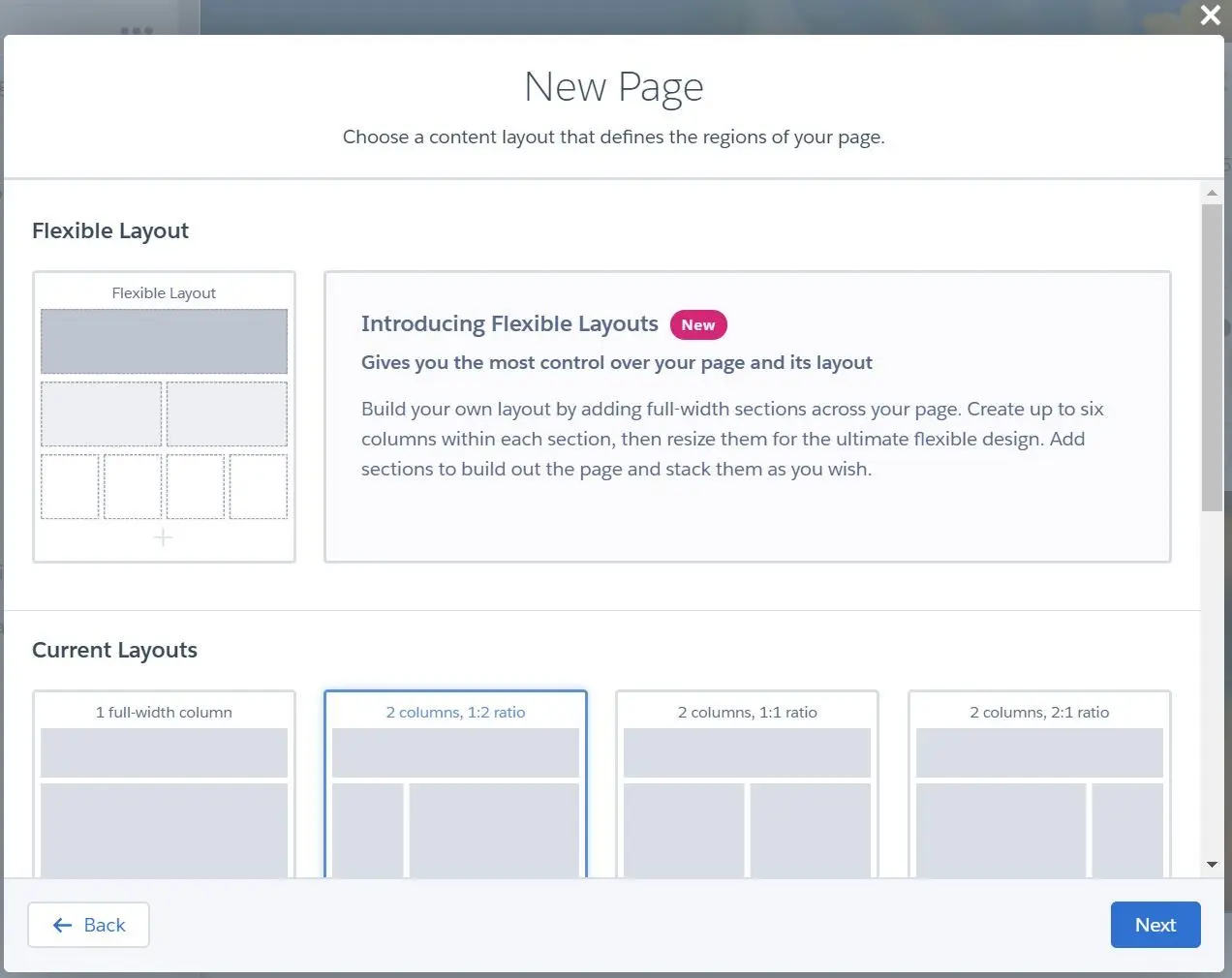
- If selected Flexible Layout, you can fully customize the layout size and add the section as many as you need.
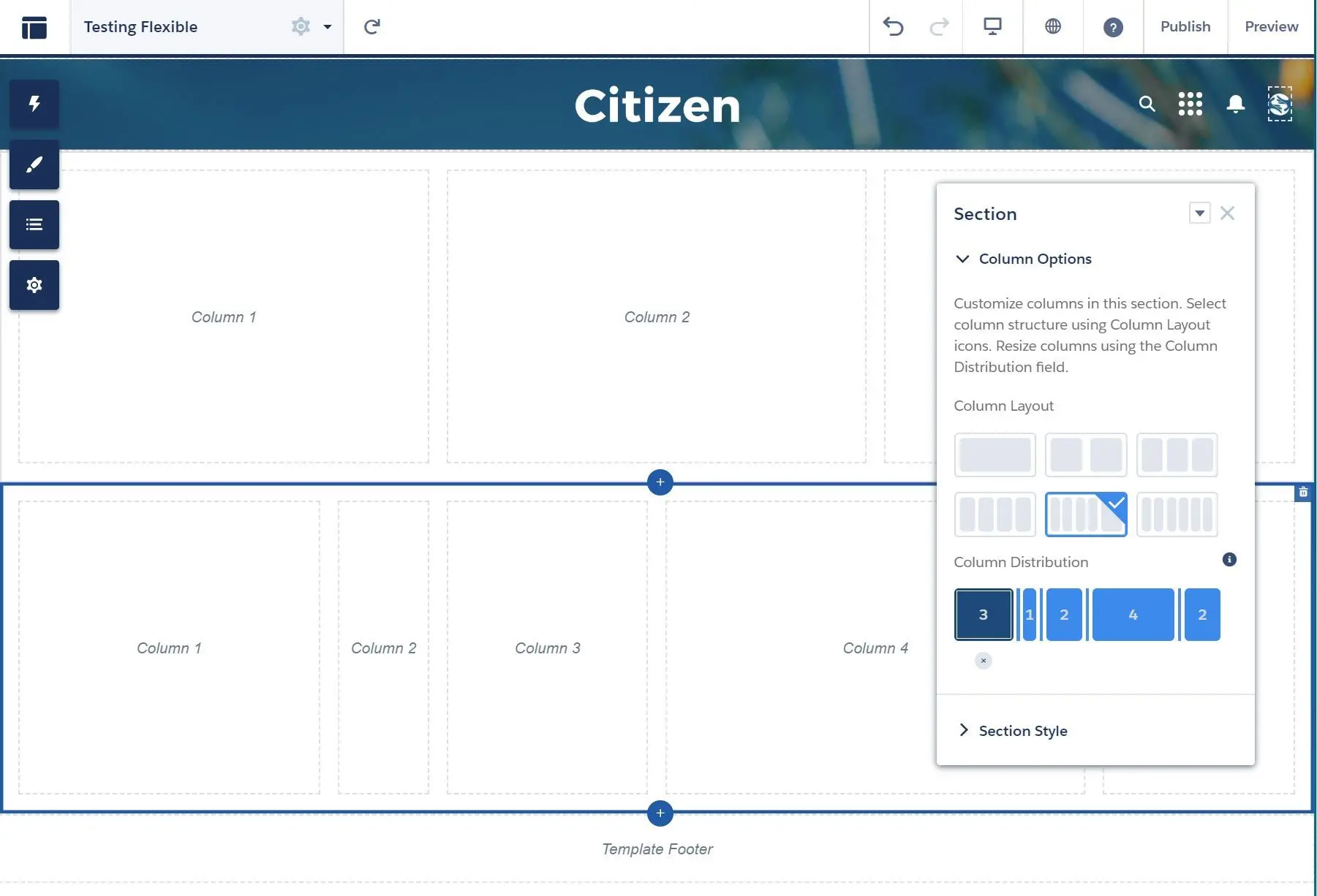
- You can even set the background color/image, set section height (32px - 400px), and set content width (25% - 100%):
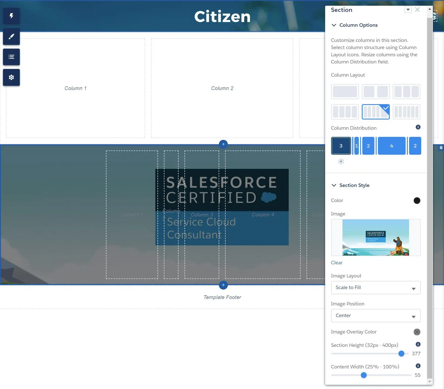
- If selected Flexible Layout, you can fully customize the layout size and add the section as many as you need.
- (Standard Page) Set page name and url:
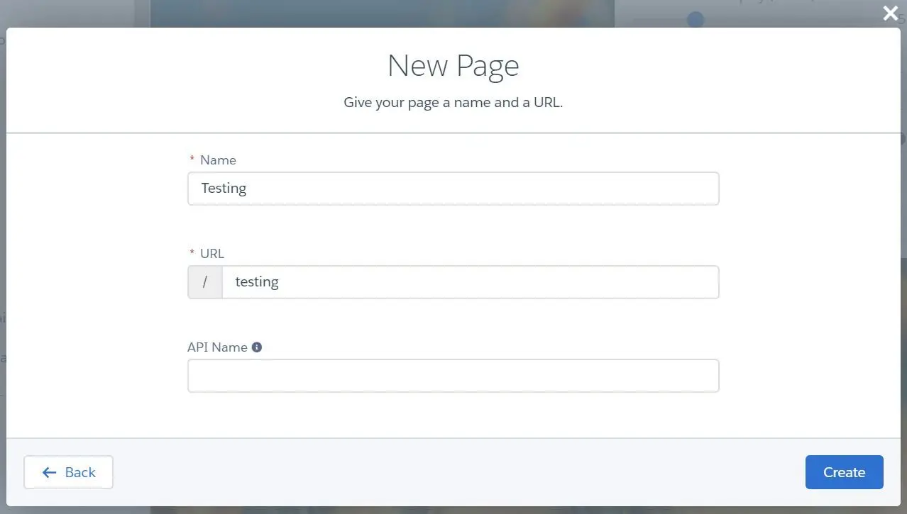
- (Standard Page) Done! Customize the page as needed.
- Navigate to Pages menu and click on New Page
- Page Variation can be created to specify different pages in order to target different audience groups.
- New Page Variation with same URL can be created:
Community Performance Optimization
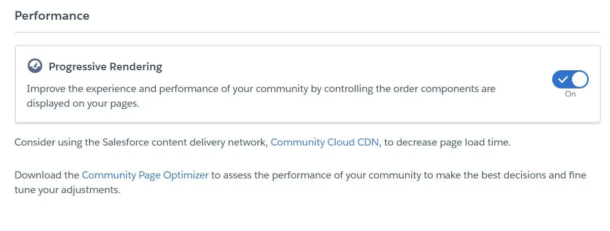
Progressive Rendering
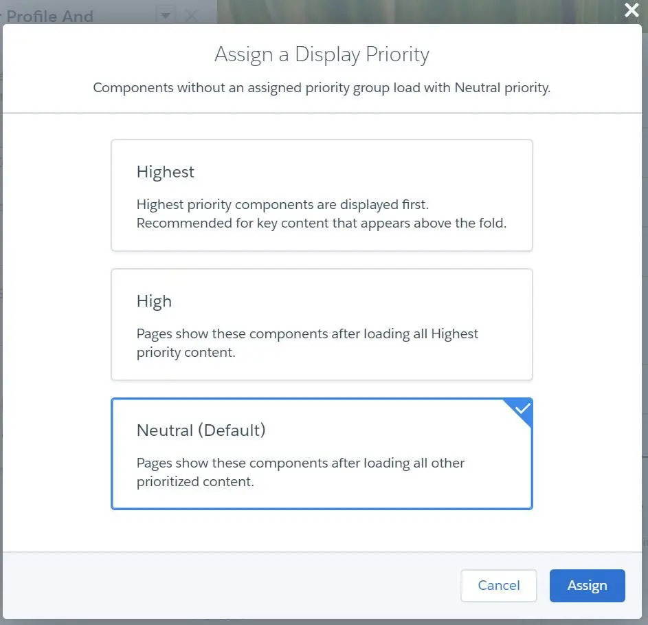
- Progressive Rendering can be used to improve the experience and performance or community by controlling the order components are displayed on the page.
- Progressive Rendering can be enabled at
Experience Builder > Settings > Advanced:
- Assign Display Priority:
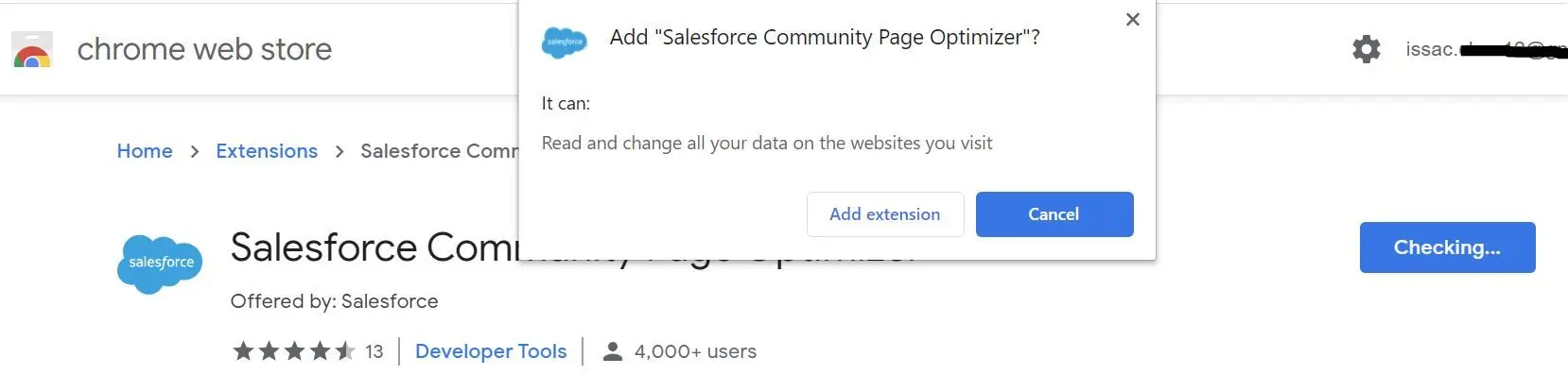
Salesforce Community Page Optimizer
- Salesforce Community Page Optimizer is a Chrome Extension that can be used to assess the performance of your community to make the best decisions and fine tune your adjustments.
- You can see overall score and the insights of your community.
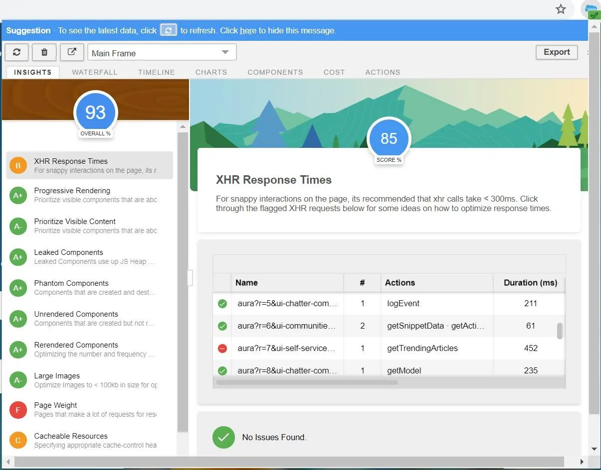
- Insights - overall performance score and individual performance scores
- Waterfall - network requests in sequential order
- Timeline - each component’s rendering life cycle
- Charts - information about memory and components
- Components - each component’s life cycle
- Cost - the time taken by each component
- Actions - list of actions performed on the page
Content Delivery Network (CDN)
- Content Delivery Network can be used to reduce page load times in community.
- Resources (such as HTML, Javascript, CSS, images, font files, etc.) that are cached on CDN (using 3rd party provider - Akamai) are accessible in public community without authentication.
- Lightning CDN for communities is enabled by default.
Well, that’s such a long post but I hope you will find it useful! See you in next post!